Prerequisites
- Completed Session 3 (or comfortable with tidyverse basics)
- Access to RStudio on Negishi via Open OnDemand
- R packages:
tidyverse,ggrepel,pheatmap,viridis,RColorBrewer,scales
This guide accompanies Genomics Exchange Session 4 (March 10, 2026). Building on the tidyverse data wrangling skills from Session 3, we now turn that clean data into publication-ready figures using ggplot2.
We will create five common genomics figure types — volcano plots, MA plots, heatmaps, enrichment bar charts, and multi-condition bar plots — using the same maize drought RNA-seq dataset from Session 3. Each section shows the default output first, then walks through the changes needed to make it ready for a journal.
Prerequisites
tidyverse, ggrepel, pheatmap, viridis, RColorBrewer, scalesWhat you will learn
Launch RStudio on RCAC
Go to gateway.negishi.rcac.purdue.edu, select Interactive Apps > RStudio Server, choose your allocation, and request 1 core, 4 GB memory, and 2 hours. Once the session starts, click Connect to RStudio.
Download the data files
In the RStudio Terminal tab (not the R console), run:
mkdir -p $RCAC_SCRATCH/genomics_exchange/session4cd $RCAC_SCRATCH/genomics_exchange/session4wget https://rcac-bioinformatics.github.io/assets/session3/deseq2_results.tsvwget https://rcac-bioinformatics.github.io/assets/session3/sample_manifest.tsvwget https://rcac-bioinformatics.github.io/assets/session3/counts_matrix.tsvwget https://rcac-bioinformatics.github.io/assets/session3/gene_annotations.tsvwget https://rcac-bioinformatics.github.io/assets/session4/fake_enrichment.tsvwget https://rcac-bioinformatics.github.io/assets/session4/session4_demo.RSet your working directory in R
Switch to the R console and run:
setwd(paste0("/scratch/negishi/", Sys.getenv("USER"), "/genomics_exchange/session4"))Set the cairo graphics device
On headless HPC sessions (no X11 display), R’s default PNG device may fail. Set the cairo backend before loading any plotting packages:
options(bitmapType = "cairo")Install and load packages
Install these packages if you have not used them before (run once):
install.packages(c("tidyverse", "ggrepel", "pheatmap", "viridis", "RColorBrewer", "scales"))Then load them:
library(tidyverse)library(ggrepel)library(pheatmap)library(viridis)library(RColorBrewer)library(scales)Set a global theme
Every ggplot starts with a default theme. Instead of adding theme customization to every plot, set it once:
theme_set(theme_minimal(base_size = 14))base_size = 14 sets a readable default font size. All text elements (axis labels, titles, legend) scale relative to this value.
We reuse the four Session 3 files and add one new enrichment results file.
deseq <- read_tsv("deseq2_results.tsv")samples <- read_tsv("sample_manifest.tsv")counts <- read_tsv("counts_matrix.tsv")genes <- read_tsv("gene_annotations.tsv")enrichment <- read_tsv("fake_enrichment.tsv")Prepare the DESeq2 results the same way we did in Session 3 — classify genes by direction and compute the transformed p-value:
deseq <- deseq %>% mutate( direction = case_when( padj < 0.05 & log2FoldChange > 1 ~ "Up", padj < 0.05 & log2FoldChange < -1 ~ "Down", TRUE ~ "NS" ), neg_log10_padj = -log10(padj) ) %>% left_join(genes, by = "gene_id")Define a color palette that we will reuse across plots. These colors are distinguishable under the three common forms of color vision deficiency:
direction_colors <- c("Down" = "#2166AC", "NS" = "grey70", "Up" = "#B2182B")The volcano plot is the signature figure of differential expression analysis. The x-axis shows biological effect size (log2 fold change) and the y-axis shows statistical significance (-log10 adjusted p-value). Genes in the upper corners are both statistically significant and biologically meaningful.
ggplot(deseq, aes(x = log2FoldChange, y = neg_log10_padj)) + geom_point()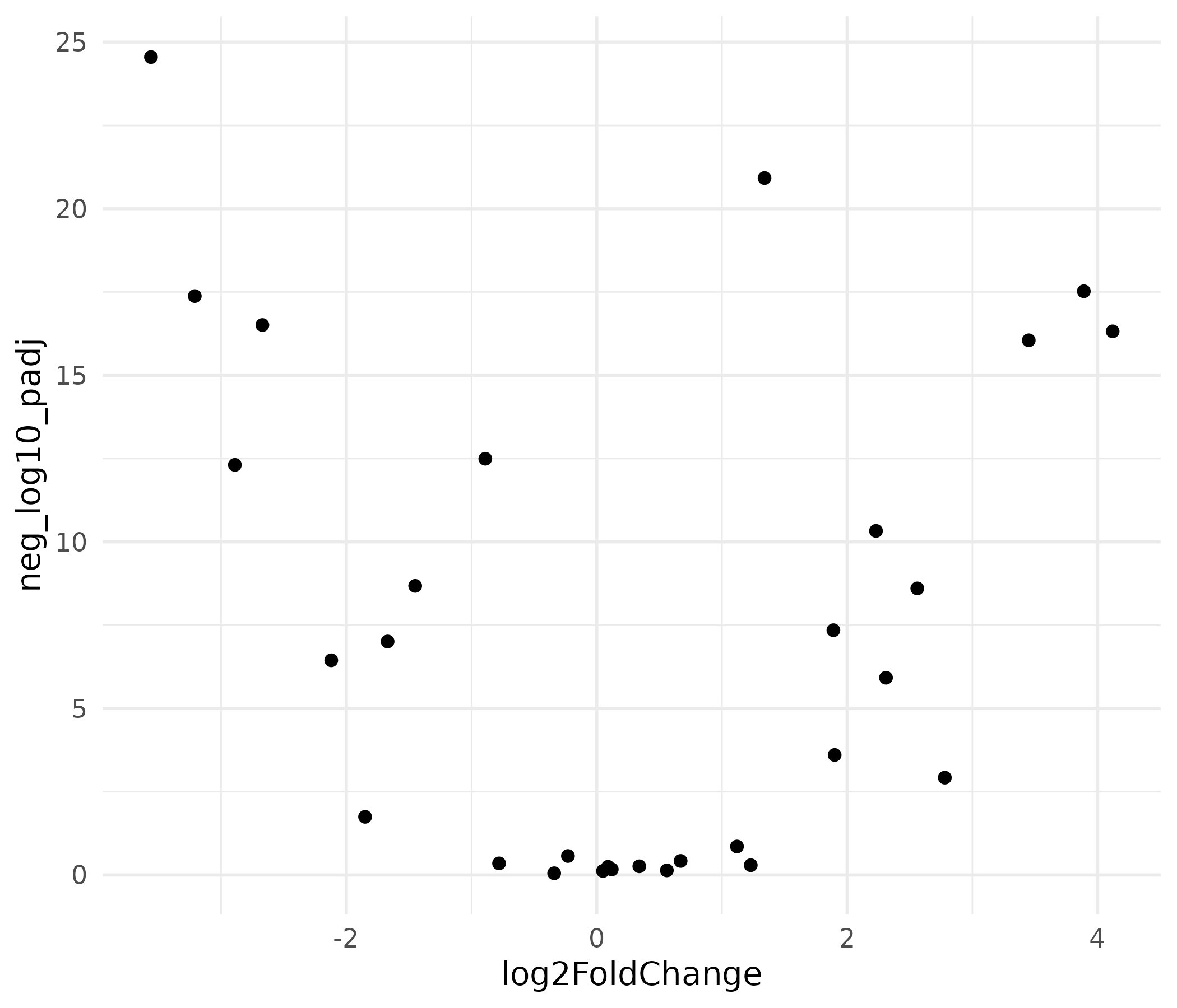
This produces a functional scatter plot, but it is not ready for publication. There is no color coding, no gene labels, no threshold lines, and the axis labels are raw variable names.
top_genes <- deseq %>%  filter(padj < 0.05) %>%  arrange(padj) %>%  slice_head(n = 8)
volcano <- ggplot(deseq, aes(x = log2FoldChange, y = neg_log10_padj,                              color = direction)) +  geom_point(size = 2, alpha = 0.8) +  geom_hline(yintercept = -log10(0.05), linetype = "dashed",             color = "grey40", linewidth = 0.5) +  geom_vline(xintercept = c(-1, 1), linetype = "dashed",             color = "grey40", linewidth = 0.5) +  geom_text_repel(    data = top_genes,    aes(label = gene_name),    size = 3.5,    max.overlaps = 15,    box.padding = 0.5,    segment.color = "grey50",    color = "black"  ) +  scale_color_manual(values = direction_colors, name = "Direction") +  labs(    x = expression(log[2]~"Fold Change"),    y = expression(-log[10]~"(adjusted p-value)"),    title = "Differential expression: drought vs. control",    subtitle = "Maize leaf tissue RNA-seq"  ) +  theme(    panel.grid.minor = element_blank(),    legend.position = "top"  )
volcano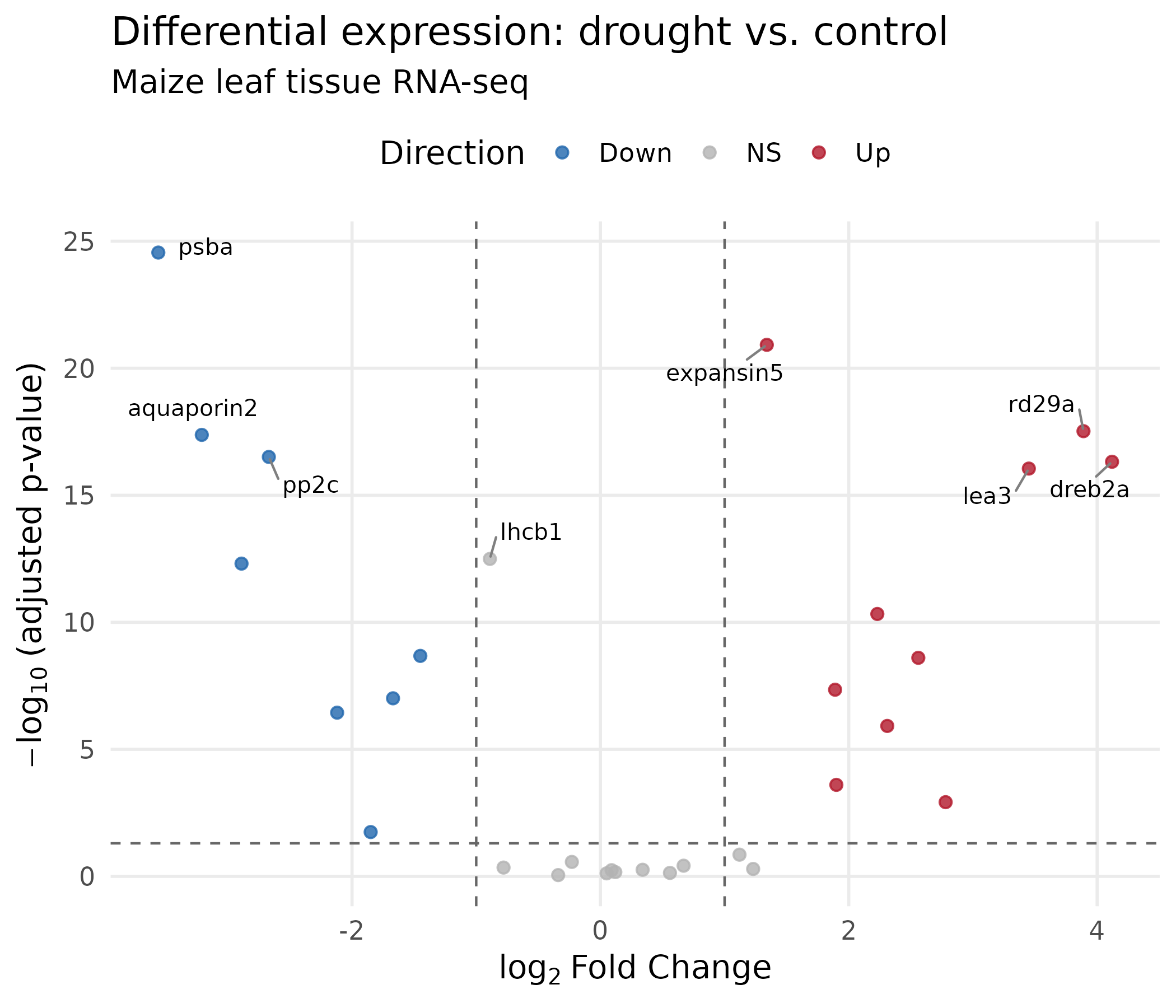
What changed and why:
geom_text_repel() from the ggrepel package positions gene labels so they do not overlap. The segment.color argument draws a line connecting each label to its point.expression() renders mathematical notation: log₂ with a proper subscript.scale_color_manual() maps direction to our colorblind-safe palette.ggsave("volcano_plot.png", volcano, width = 7, height = 6, dpi = 300, units = "in")ggsave("volcano_plot.pdf", volcano, width = 7, height = 6, units = "in")The MA plot shows mean expression level (x-axis) vs. fold change (y-axis). It reveals whether fold change estimates depend on expression level — low-count genes tend to have noisier fold changes. This is a standard QC figure in RNA-seq analysis.
ggplot(deseq, aes(x = baseMean, y = log2FoldChange)) + geom_point()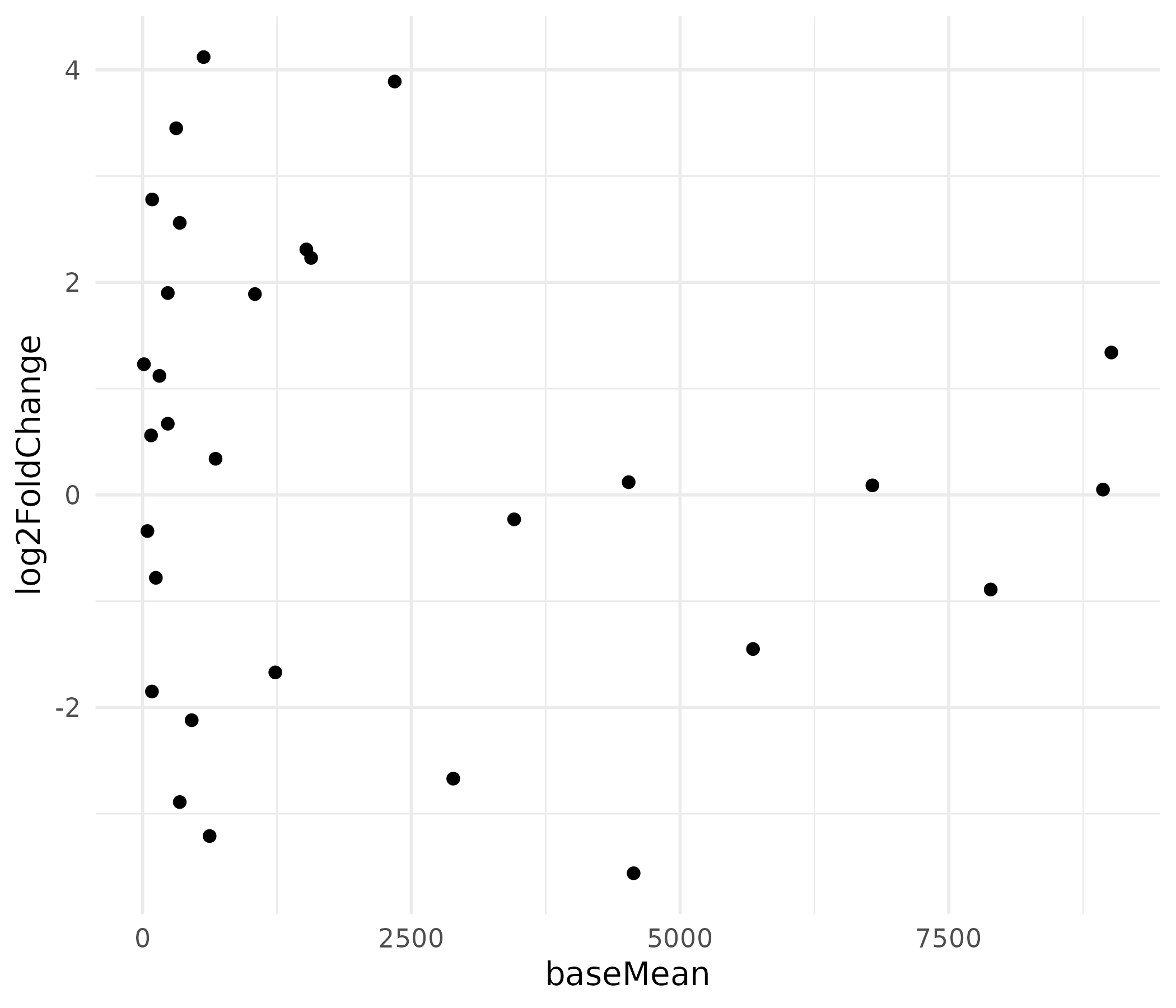
The x-axis is heavily right-skewed because a few highly expressed genes dominate the scale, compressing most points to the left.
ma_plot <- ggplot(deseq, aes(x = baseMean, y = log2FoldChange,                              color = direction)) +  geom_point(size = 2, alpha = 0.8) +  geom_hline(yintercept = 0, linetype = "solid",             color = "grey30", linewidth = 0.5) +  scale_x_log10(    labels = label_comma(),    breaks = c(10, 100, 1000, 10000)  ) +  scale_color_manual(values = direction_colors, name = "Direction") +  geom_text_repel(    data = deseq %>% filter(abs(log2FoldChange) > 3),    aes(label = gene_name),    size = 3.5,    color = "black",    max.overlaps = 10  ) +  labs(    x = "Mean normalized counts (log scale)",    y = expression(log[2]~"Fold Change"),    title = "MA plot: expression level vs. fold change"  ) +  theme(    panel.grid.minor = element_blank(),    legend.position = "top"  )
ma_plot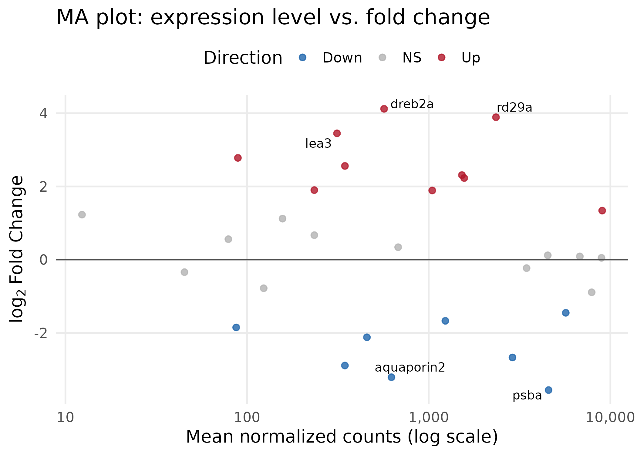
Key choices:
scale_x_log10() spreads the heavily right-skewed baseMean distribution, making all genes visible. The label_comma() function from the scales package keeps axis labels human-readable (e.g., “1,000” instead of scientific notation).ggsave("ma_plot.png", ma_plot, width = 7, height = 5, dpi = 300, units = "in")ggsave("ma_plot.pdf", ma_plot, width = 7, height = 5, units = "in")Heatmaps display expression patterns across genes (rows) and samples (columns) using color intensity. They are effective at showing groups of co-regulated genes and whether samples cluster by experimental condition. We use the pheatmap package, which handles clustering and annotation sidebars.
sig_genes <- deseq %>%  filter(padj < 0.05) %>%  arrange(padj) %>%  pull(gene_id)
count_matrix <- counts %>%  filter(gene_id %in% sig_genes) %>%  column_to_rownames("gene_id") %>%  as.matrix()
Replace gene IDs with readable gene names:
gene_name_lookup <- deseq %>%  filter(gene_id %in% sig_genes) %>%  select(gene_id, gene_name) %>%  deframe()
rownames(count_matrix) <- gene_name_lookup[rownames(count_matrix)]
Scale the rows (z-score normalization) so the color represents relative change within each gene, not absolute expression level. Without scaling, highly expressed housekeeping genes would dominate the color map:
count_scaled <- t(scale(t(count_matrix)))pheatmap(count_scaled)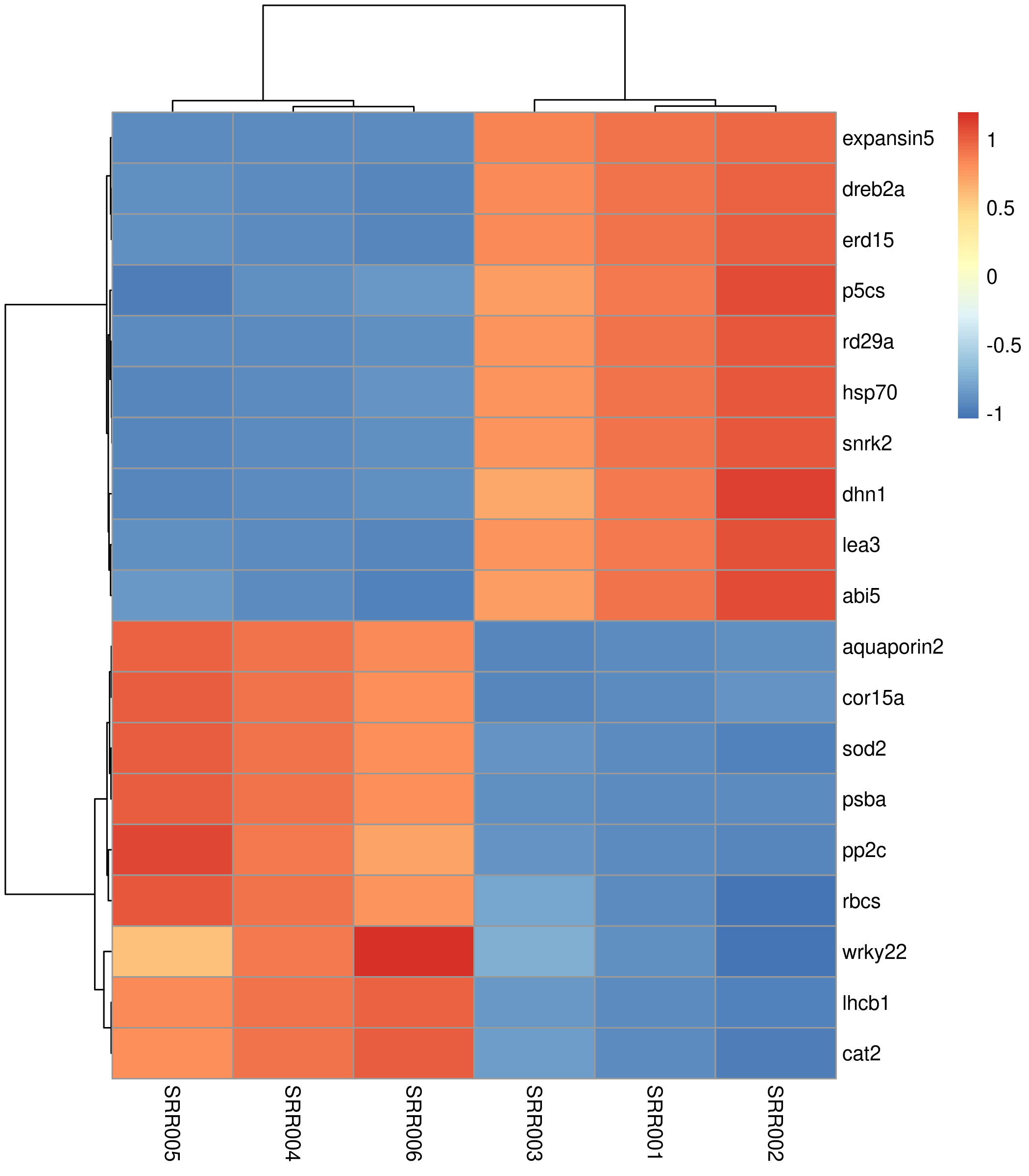
The default heatmap uses a blue-to-red palette, clusters both rows and columns, and works. But it lacks sample annotations and uses a suboptimal color scheme.
sample_annot <- samples %>%  select(sample_id, condition) %>%  column_to_rownames("sample_id")
annot_colors <- list(  condition = c("drought" = "#D53E4F", "control" = "#3288BD"))
heatmap_colors <- colorRampPalette(  rev(brewer.pal(9, "RdBu")))(100)
pheatmap(  count_scaled,  color             = heatmap_colors,  annotation_col    = sample_annot,  annotation_colors = annot_colors,  clustering_method  = "ward.D2",  cluster_cols       = TRUE,  cluster_rows       = TRUE,  show_colnames      = TRUE,  show_rownames      = TRUE,  fontsize           = 11,  fontsize_row       = 10,  fontsize_col       = 10,  border_color       = NA,  main               = "Expression of DE genes (z-score scaled)",  angle_col          = 45)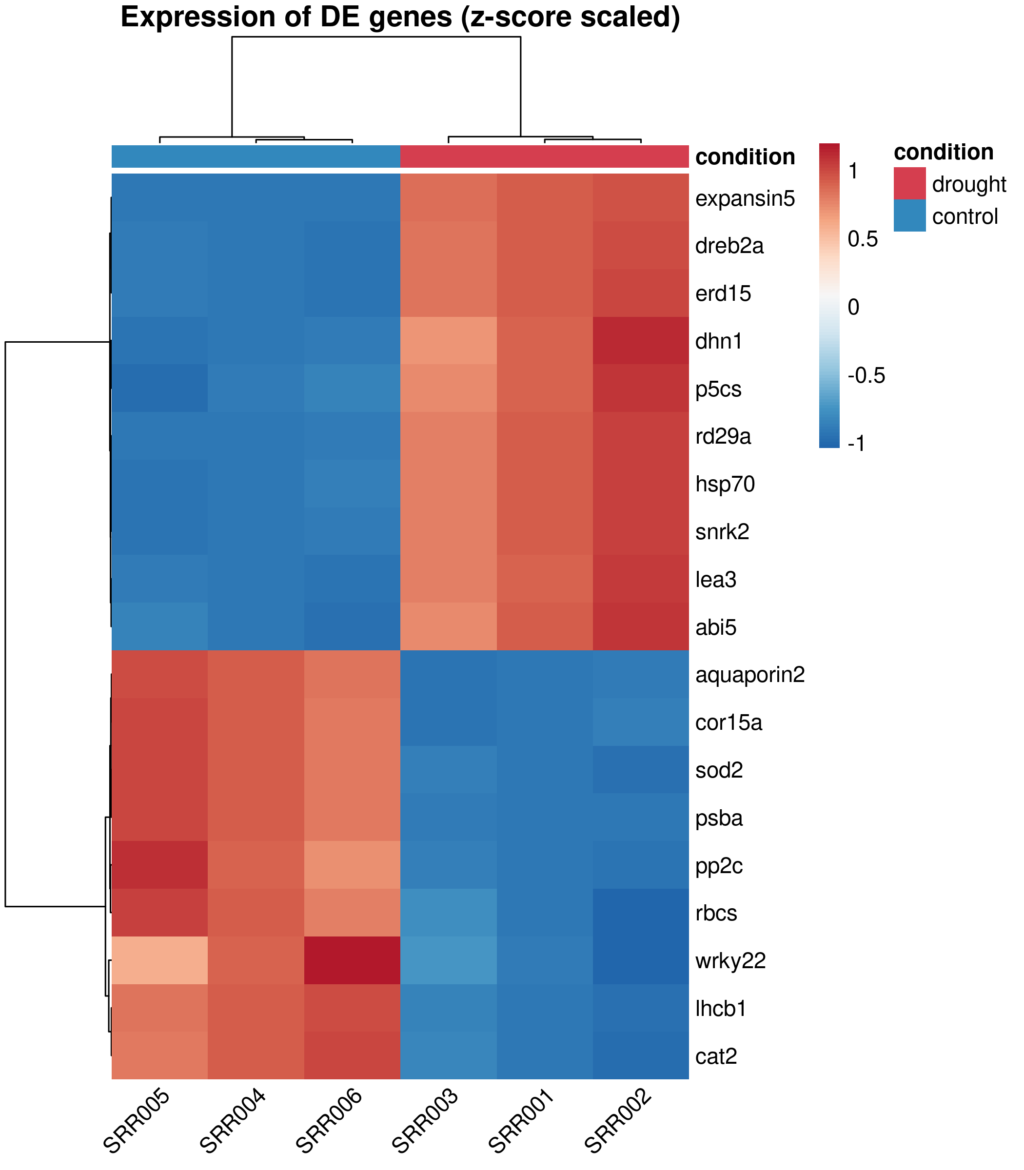
Design decisions:
RdBu palette (Red-Blue, diverging) is colorblind-safe and conventional for expression heatmaps. Blue = low, white = unchanged, red = high.annotation_col adds a colored sidebar showing which condition each sample belongs to, so readers immediately see the grouping.ward.D2 clustering produces compact, well-separated clusters. It is the default recommendation for expression data.border_color = NA removes the grid between cells, which adds visual noise in dense heatmaps.pheatmap does not return a ggplot object, so we use png() / pdf() with dev.off() instead of ggsave():
png("heatmap_de_genes.png", width = 7, height = 8, units = "in", res = 300, type = "cairo")pheatmap( count_scaled, color = heatmap_colors, annotation_col = sample_annot, annotation_colors = annot_colors, clustering_method = "ward.D2", border_color = NA, fontsize = 11, main = "Expression of DE genes (z-score scaled)", angle_col = 45)dev.off()For PDF:
pdf("heatmap_de_genes.pdf", width = 7, height = 8)# ... same pheatmap() call ...dev.off()GO or functional enrichment analysis summarizes the biological themes among your differentially expressed genes. Here we use a small simulated enrichment result to demonstrate two common visualization styles: a dot plot and a bar chart.
enrichmentEach row is a GO term with its name, gene count, fold enrichment, and adjusted p-value.
ggplot(enrichment, aes(x = term_name, y = fold_enrichment)) + geom_col()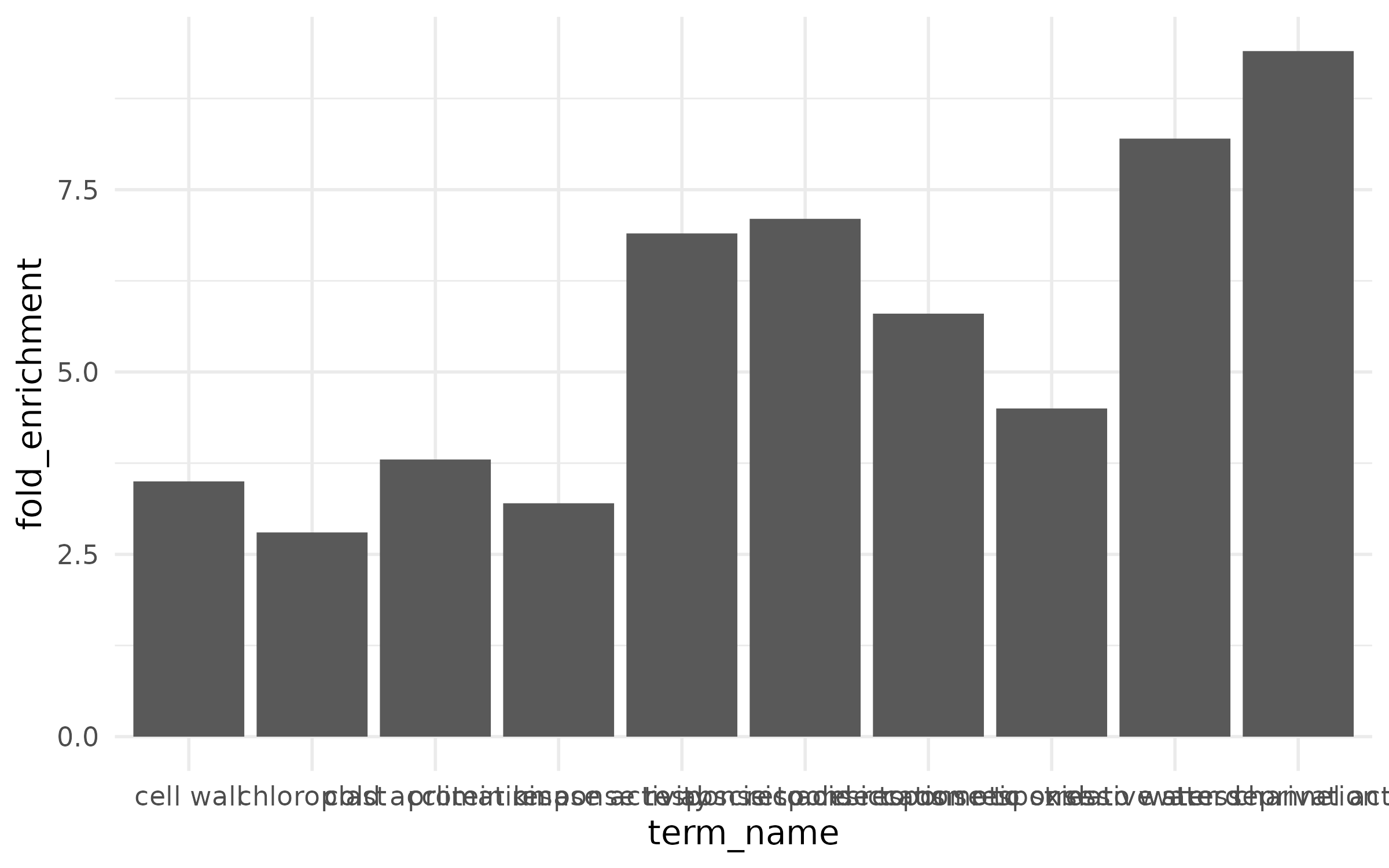
The x-axis labels overlap and are unreadable, there is no color to convey additional information, and terms are in alphabetical order instead of ranked by effect.
The dot plot encodes three variables: x-position (fold enrichment), color (category), and point size (gene count).
enrich_plot <- enrichment %>%  mutate(term_name = fct_reorder(term_name, fold_enrichment)) %>%  ggplot(aes(x = fold_enrichment, y = term_name,             fill = category, size = gene_count)) +  geom_point(shape = 21, color = "black", stroke = 0.5) +  scale_fill_manual(    values = c("BP" = "#1B9E77", "MF" = "#D95F02", "CC" = "#7570B3"),    name = "Category",    labels = c("BP" = "Biological Process",               "MF" = "Molecular Function",               "CC" = "Cellular Component")  ) +  scale_size_continuous(range = c(3, 10), name = "Gene count") +  labs(    x = "Fold enrichment",    y = NULL,    title = "GO enrichment of drought-responsive genes"  ) +  theme(    panel.grid.major.y = element_blank(),    legend.position = "right"  )
enrich_plot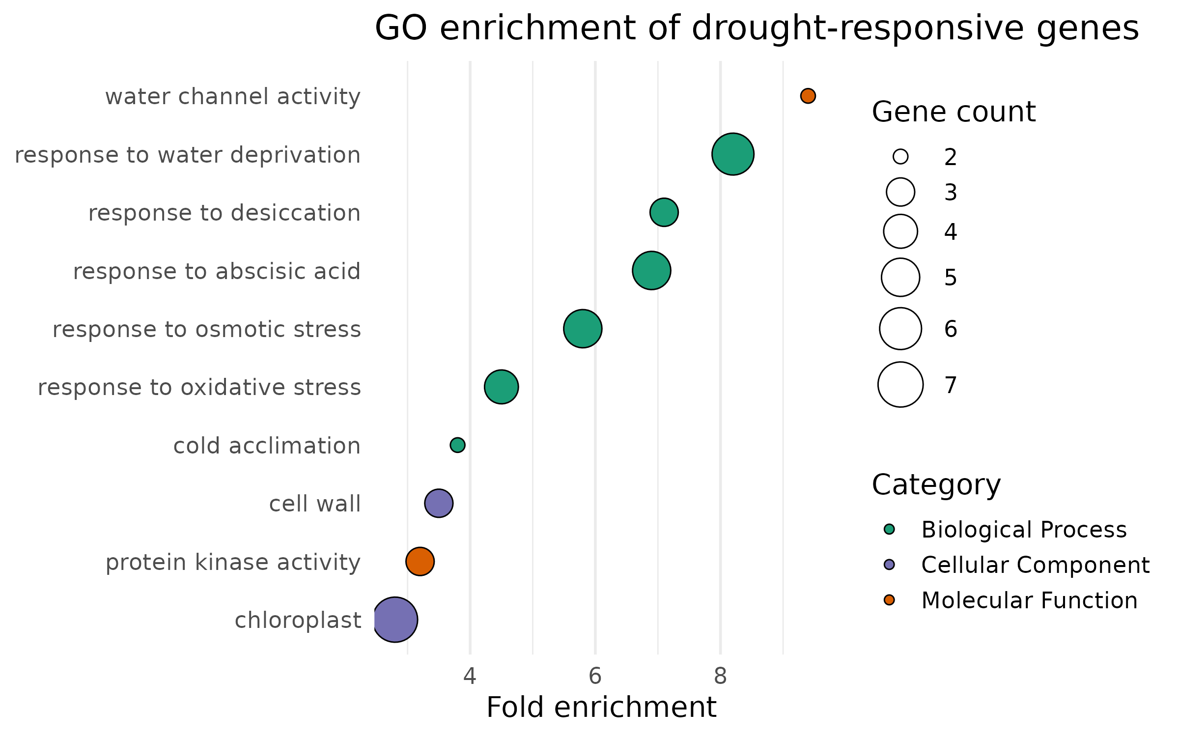
The bar chart uses color to encode significance instead of category:
enrich_bar <- enrichment %>%  mutate(    term_name = fct_reorder(term_name, fold_enrichment),    neg_log10_padj = -log10(padj)  ) %>%  ggplot(aes(x = fold_enrichment, y = term_name, fill = neg_log10_padj)) +  geom_col(width = 0.7) +  geom_text(aes(label = paste0("n=", gene_count)),            hjust = -0.2, size = 3.5) +  scale_fill_viridis_c(    option = "plasma",    name = expression(-log[10]~"(padj)"),    direction = -1  ) +  scale_x_continuous(expand = expansion(mult = c(0, 0.15))) +  labs(    x = "Fold enrichment",    y = NULL,    title = "GO enrichment of drought-responsive genes"  ) +  theme(    panel.grid.major.y = element_blank(),    panel.grid.minor   = element_blank()  )
enrich_bar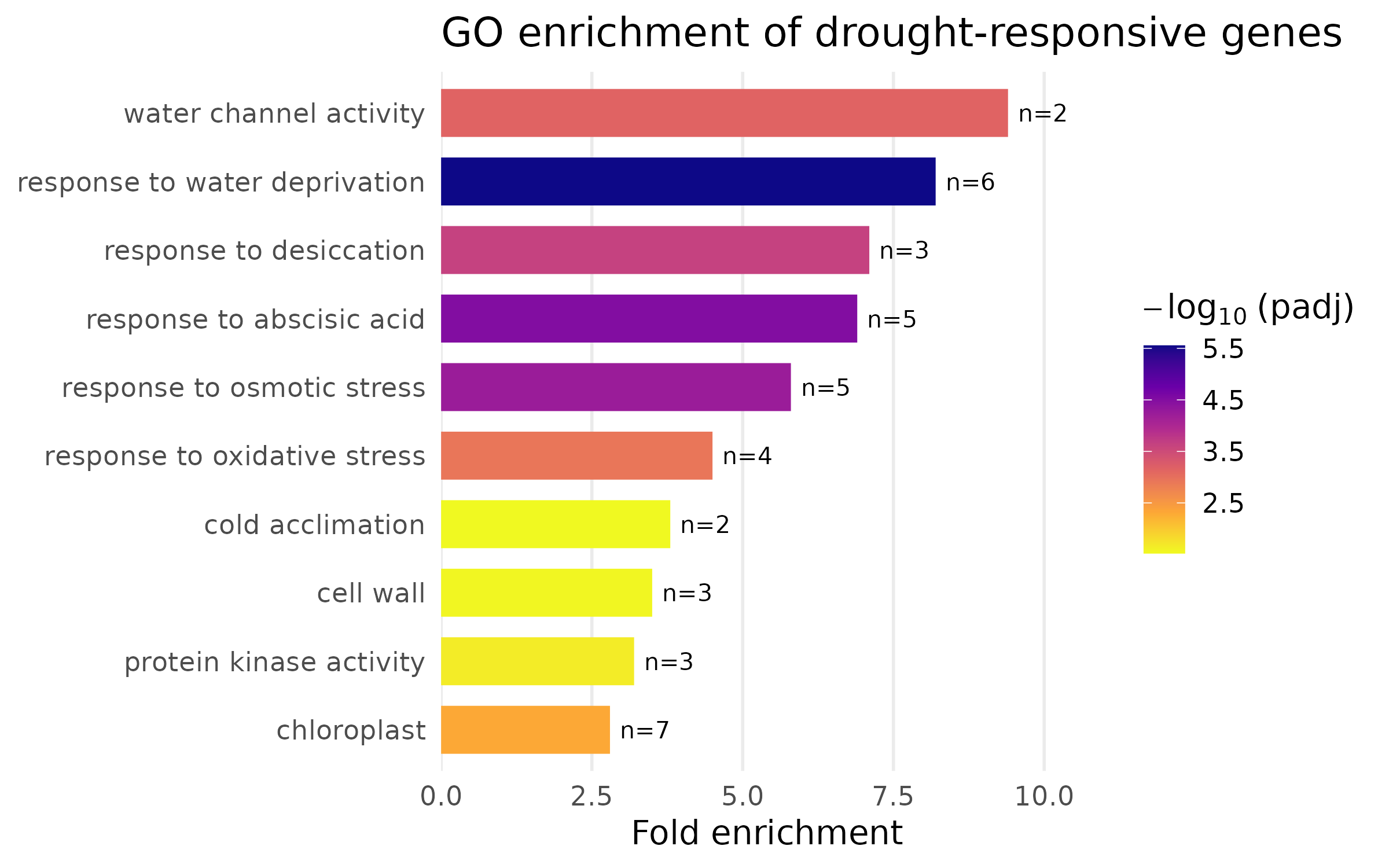
Design notes:
fct_reorder() sorts terms by fold enrichment so the most enriched terms appear at the top. Never leave categorical axes in alphabetical order — rank them by the variable of interest.viridis “plasma” palette is perceptually uniform and colorblind-safe. The continuous color scale maps significance, giving the reader two dimensions of information.ggsave("enrichment_dotplot.png", enrich_plot, width = 8, height = 5, dpi = 300, units = "in")ggsave("enrichment_barplot.png", enrich_bar, width = 8, height = 5, dpi = 300, units = "in")This section demonstrates the iterative improvement process. We start with a default ggplot bar chart and fix one problem at a time.
top6 <- deseq %>%  filter(direction != "NS") %>%  arrange(padj) %>%  slice_head(n = 6)
counts_long <- counts %>%  pivot_longer(cols = starts_with("SRR"),               names_to = "sample_id", values_to = "count") %>%  left_join(samples, by = "sample_id") %>%  left_join(genes, by = "gene_id")
plot_data <- counts_long %>% filter(gene_id %in% top6$gene_id) %>% group_by(gene_name, condition) %>% summarize( mean_count = mean(count), se_count = sd(count) / sqrt(n()), .groups = "drop" )p_ugly <- ggplot(plot_data, aes(x = gene_name, y = mean_count, fill = condition)) + geom_col(position = "dodge")
p_ugly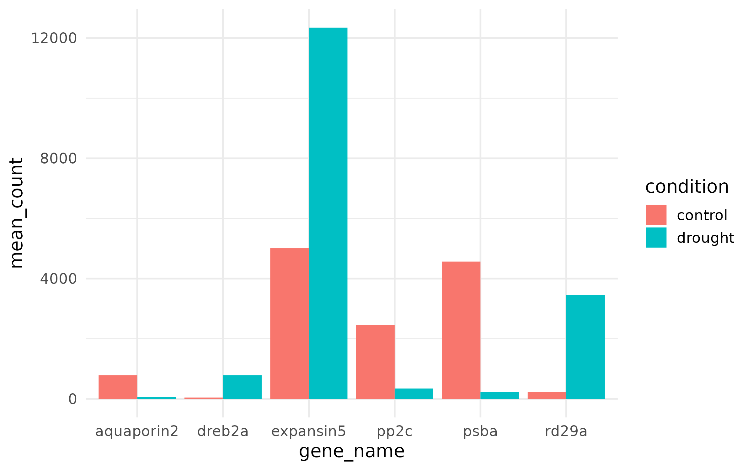
What is wrong:
p_step2 <- p_ugly + theme_minimal(base_size = 14)
p_step3 <- p_step2 + scale_fill_manual(values = c("control" = "#3288BD", "drought" = "#D53E4F"), name = "Condition")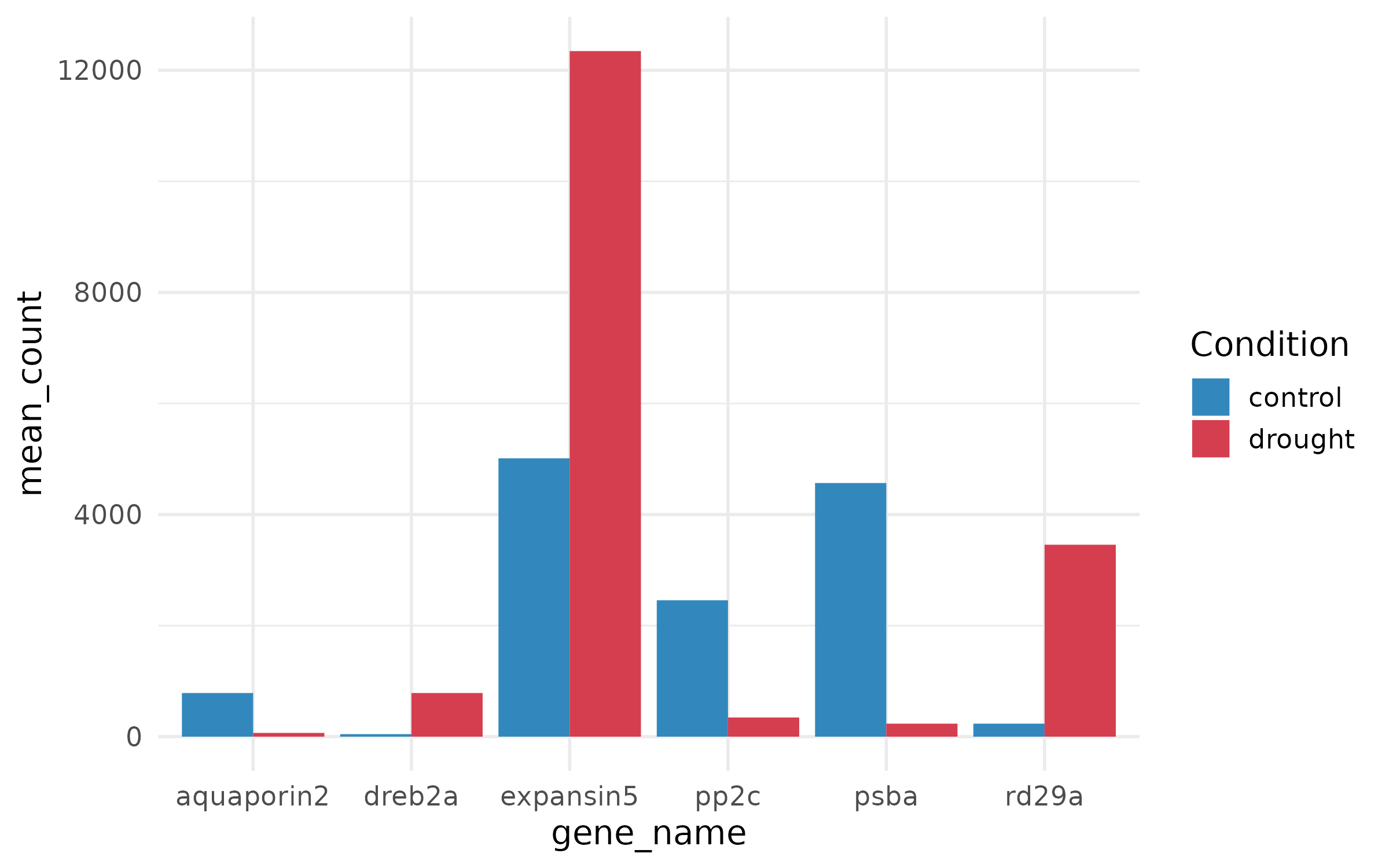
p_step4 <- ggplot(plot_data, aes(x = gene_name, y = mean_count, fill = condition)) + geom_col(position = position_dodge(width = 0.8), width = 0.7) + geom_errorbar( aes(ymin = mean_count - se_count, ymax = mean_count + se_count), position = position_dodge(width = 0.8), width = 0.25, linewidth = 0.5 ) + scale_fill_manual(values = c("control" = "#3288BD", "drought" = "#D53E4F"), name = "Condition") + labs( x = NULL, y = "Mean normalized counts", title = "Expression of top DE genes", subtitle = "Drought vs. control (mean +/- SE, n = 3)" ) + theme_minimal(base_size = 14)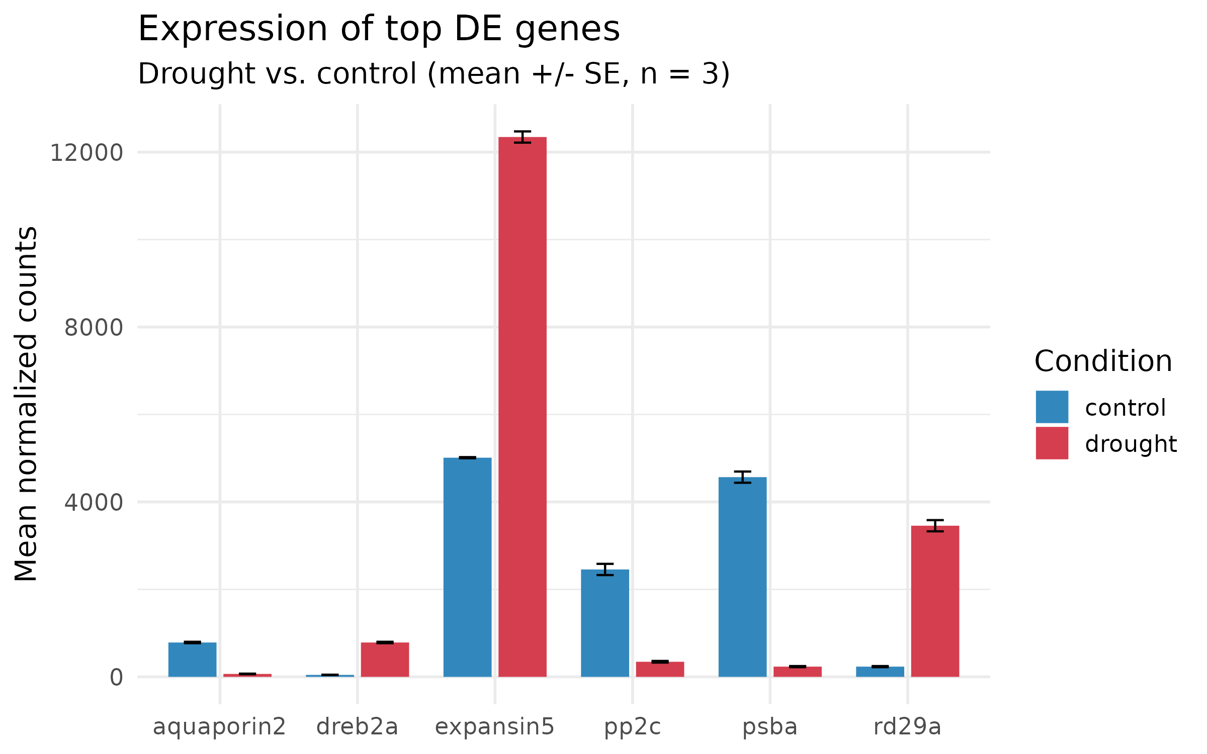
p_final <- p_step4 +  theme(    panel.grid.minor   = element_blank(),    panel.grid.major.x = element_blank(),    legend.position    = c(0.85, 0.85),    legend.background  = element_rect(fill = "white", color = NA),    axis.text.x        = element_text(face = "italic", size = 12)  ) +  scale_y_continuous(expand = expansion(mult = c(0, 0.1)))
p_final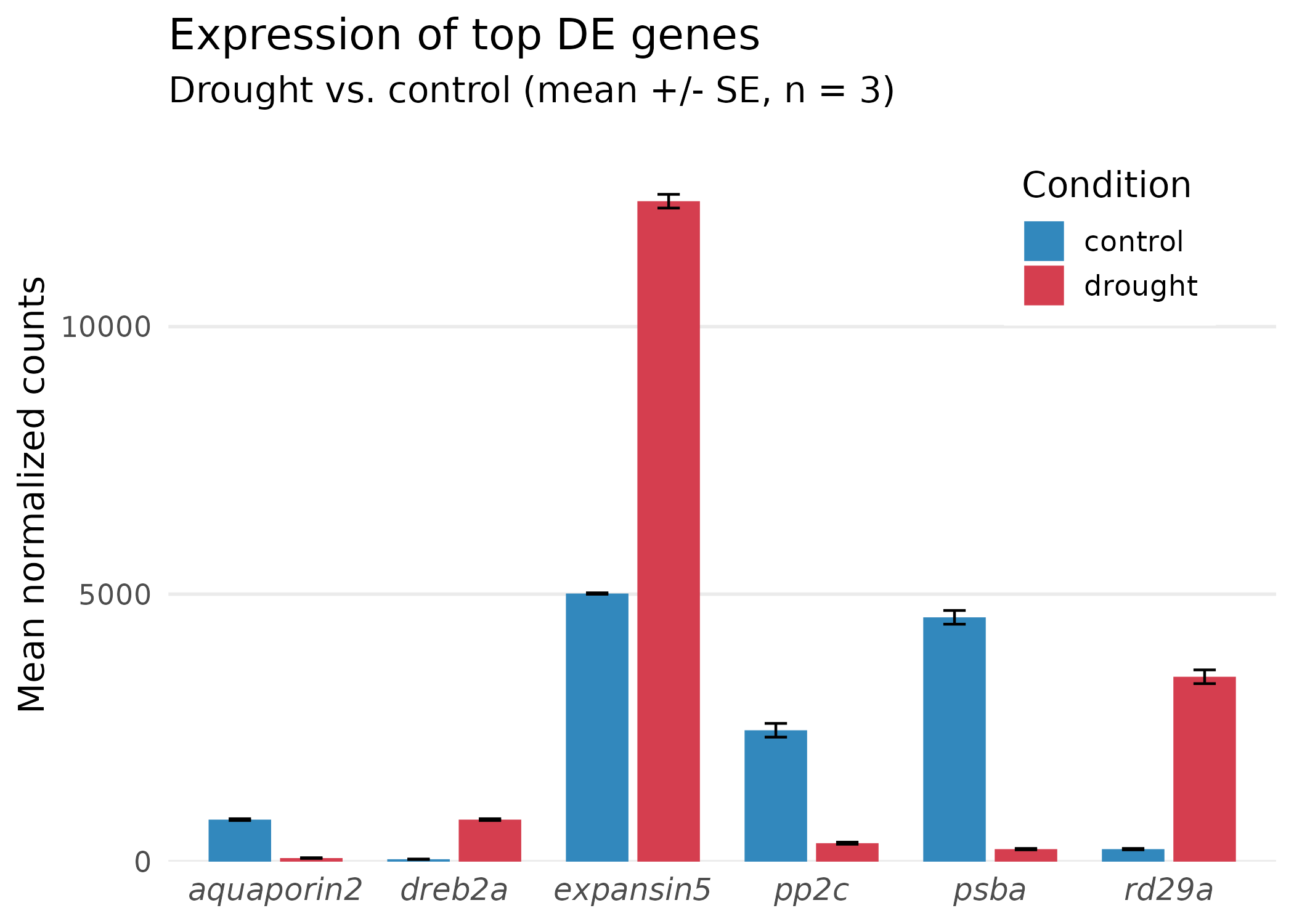
What changed in the final step:
ggsave("barplot_ugly.png", p_ugly, width = 7, height = 5, dpi = 300, units = "in")ggsave("barplot_final.png", p_final, width = 7, height = 5, dpi = 300, units = "in")ggsave("barplot_final.pdf", p_final, width = 7, height = 5, units = "in")Approximately 8% of men and 0.5% of women have some form of color vision deficiency. Every figure you publish should be readable by this audience.
Recommended palettes:
| Palette | Package | Best for | How to use |
|---|---|---|---|
| viridis | viridis | Continuous data (expression, p-values) | scale_fill_viridis_c() |
| RdBu | RColorBrewer | Diverging data (fold changes, z-scores) | scale_fill_distiller(palette = "RdBu") |
| Dark2 | RColorBrewer | Categorical data (2-8 groups) | scale_color_brewer(palette = "Dark2") |
| Set2 | RColorBrewer | Categorical data (lighter variant) | scale_fill_brewer(palette = "Set2") |
To see all colorblind-safe palettes in RColorBrewer:
display.brewer.all(colorblindFriendly = TRUE)| Question | Plot type | Key ggplot2 function |
|---|---|---|
| Which genes are significant and large-effect? | Volcano plot | geom_point() + geom_text_repel() |
| Does fold change depend on expression level? | MA plot | geom_point() + scale_x_log10() |
| How do expression patterns cluster? | Heatmap | pheatmap() |
| What biological themes are enriched? | Enrichment dot/bar plot | geom_point() or geom_col() |
| How does one gene differ between conditions? | Box/bar plot | geom_boxplot() or geom_col() |
Most journals specify figure dimensions and resolution. Common requirements:
| Journal tier | Format | DPI | Max width |
|---|---|---|---|
| Nature family | PDF or TIFF | 300 | 180 mm (7.1 in) |
| Cell family | PDF or EPS | 300 | 174 mm (6.85 in) |
| PLOS journals | TIFF or EPS | 300 | 174 mm (6.85 in) |
| General rule | PDF + PNG | 300 | 170 mm (~6.7 in) |
Standard column widths:
# Single column: ~3.15 in (80 mm)# 1.5 column: ~5.51 in (140 mm)# Double column: ~6.69 in (170 mm)Always check your target journal’s author guidelines before final export. Use ggsave() with explicit width, height, dpi, and units for every figure.
| Element | Minimum size | ggplot2 parameter |
|---|---|---|
| Axis labels | 8–10 pt | theme(axis.title = element_text(size = ...)) |
| Axis tick labels | 7–9 pt | theme(axis.text = element_text(size = ...)) |
| Legend text | 7–9 pt | theme(legend.text = element_text(size = ...)) |
| Title | 10–12 pt | theme(plot.title = element_text(size = ...)) |
| Panel labels (facets) | 8–10 pt | theme(strip.text = element_text(size = ...)) |
If you produce many figures for one project or paper, define a custom theme once and apply it everywhere:
theme_publication <- function(base_size = 14) {  theme_minimal(base_size = base_size) %+replace%    theme(      panel.grid.minor    = element_blank(),      panel.grid.major    = element_line(color = "grey92", linewidth = 0.4),      axis.line           = element_line(color = "grey30", linewidth = 0.4),      axis.ticks          = element_line(color = "grey30", linewidth = 0.3),      strip.background    = element_rect(fill = "grey95", color = NA),      strip.text          = element_text(face = "bold", size = base_size),      plot.title          = element_text(face = "bold", hjust = 0,                                         size = base_size + 2),      plot.subtitle       = element_text(color = "grey40", hjust = 0),      plot.title.position = "plot"    )}
theme_set(theme_publication())| Task | Function | Example |
|---|---|---|
| Scatter plot | geom_point() | aes(x, y, color) |
| Bar chart | geom_col() | aes(x, y, fill) |
| Error bars | geom_errorbar() | aes(ymin, ymax) |
| Non-overlapping labels | geom_text_repel() | aes(label) (from ggrepel) |
| Horizontal line | geom_hline() | yintercept = 0 |
| Vertical line | geom_vline() | xintercept = c(-1, 1) |
| Log scale | scale_x_log10() | Spread skewed data |
| Manual colors | scale_color_manual() | values = c("A" = "#hex") |
| Viridis continuous | scale_fill_viridis_c() | Colorblind-safe gradient |
| Brewer discrete | scale_fill_brewer() | palette = "Dark2" |
| Readable numbers | label_comma() | 10000 becomes 10,000 |
| Math notation | expression() | expression(log[2]~"FC") |
| Reorder factor | fct_reorder() | Sort categorical axis by a numeric variable |
| Save figure | ggsave() | width, height, dpi, units |
| Set global theme | theme_set() | Apply once, affects all plots |
This is almost always a missing graphics device. Set the cairo backend at the top of your script:
options(bitmapType = "cairo")If cairo is not available, try:
capabilities()["cairo"]If it returns FALSE, use type = "Xlib" in ggsave() or export as PDF instead (which does not need a bitmap device).
Increase max.overlaps:
geom_text_repel(max.overlaps = 20)Or reduce the number of labeled points by filtering more strictly:
top_genes <- deseq %>% filter(padj < 0.001) %>% slice_head(n = 5)The number of colors in your palette must be large enough to represent the data range. Use at least 50–100 colors:
heatmap_colors <- colorRampPalette(rev(brewer.pal(9, "RdBu")))(100)If your z-scores are extreme, the color scale may be dominated by outliers. You can set symmetric breaks:
max_val <- max(abs(count_scaled), na.rm = TRUE)breaks <- seq(-max_val, max_val, length.out = 101)pheatmap(count_scaled, color = heatmap_colors, breaks = breaks)The RStudio plot pane uses screen rendering, while ggsave() uses the file device. To get consistent results, always judge your figures from the saved file, not the plot pane. Open the PNG in an image viewer or the PDF in a PDF reader.
pheatmap is simpler and covers most use cases. ComplexHeatmap (Bioconductor) is more powerful — it supports multiple annotation tracks, split heatmaps, and oncoplots. If you need to show more than one annotation (e.g., condition + batch + genotype), switch to ComplexHeatmap. For a single condition annotation like we have here, pheatmap is sufficient.
Yes. Everything here applies to any differential expression or enrichment result, regardless of organism. Swap the gene IDs, GO terms, and condition labels, and the same code works for human, Arabidopsis, mouse, or any species.
Use the patchwork package:
# install.packages("patchwork")library(patchwork)
(volcano | ma_plot) / enrich_bar +  plot_annotation(tag_levels = "A")
This creates a 2-over-1 layout with panel labels A, B, C. Most journals require multi-panel figures as a single file.
ggsave("figure1.tiff", volcano, width = 7, height = 6, dpi = 300, units = "in", compression = "lzw")The compression = "lzw" flag reduces file size significantly. Some journals accept LZW-compressed TIFFs; others require uncompressed. Check the author guidelines.
Session 5 (March 24): Running bioinformatics programs on RCAC. We will cover how to use the module system, run containerized tools with Apptainer, submit SLURM jobs, and manage bioinformatics workflows on RCAC clusters.