All Images
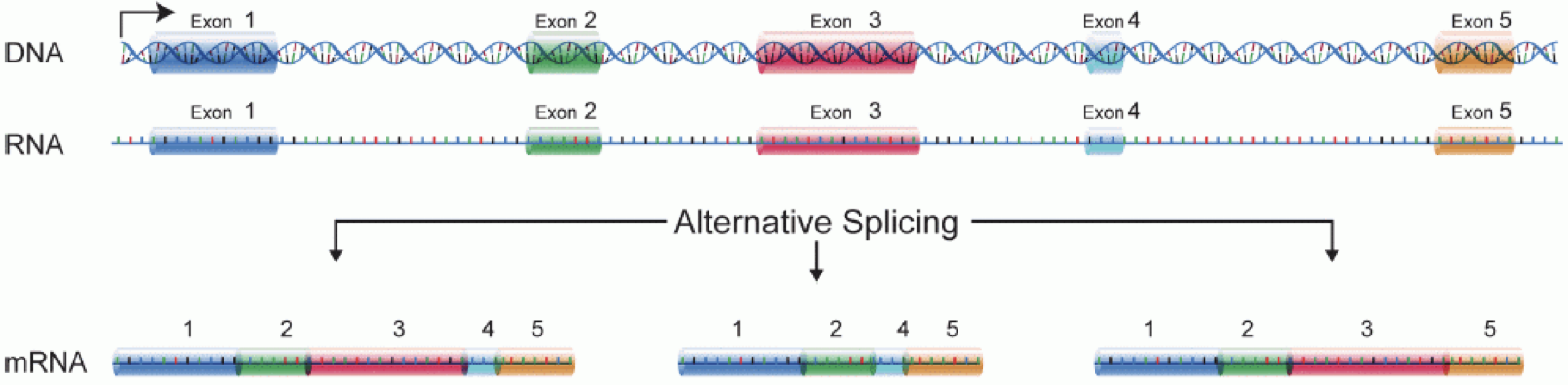
Image 1 of 1: ‘Illustration of part of the central dogma of molecular biology, where DNA is transcribed to RNA, and intronic sequences are spliced out’
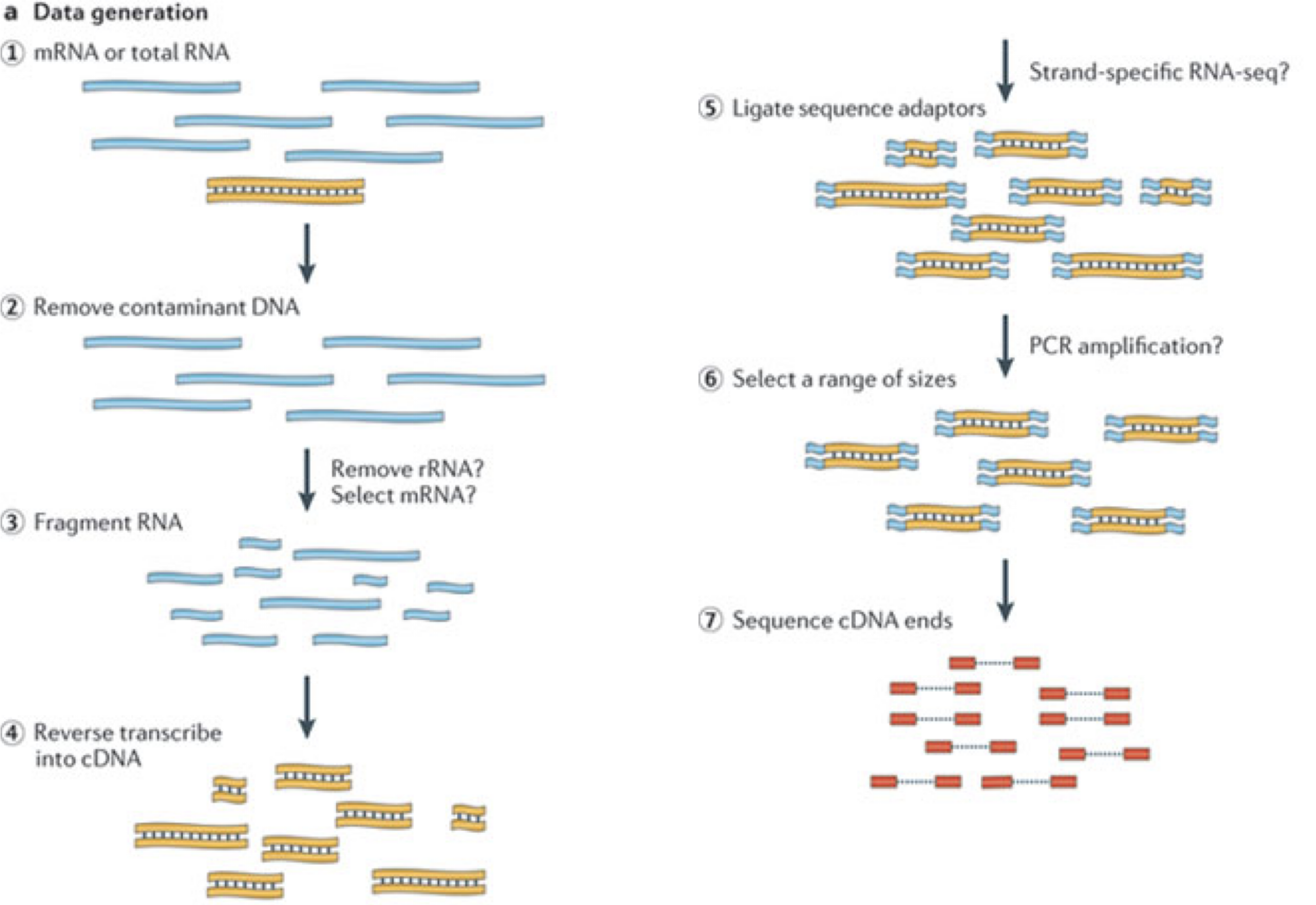
Image 1 of 1: ‘Illustration of the major experimental steps of an RNA-seq experiment’
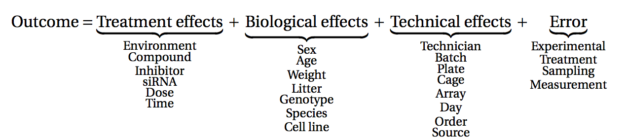
Image 1 of 1: ‘A classification of many different factors affecting measurements obtained from an experiment into treatment, biological, technical and error effects’
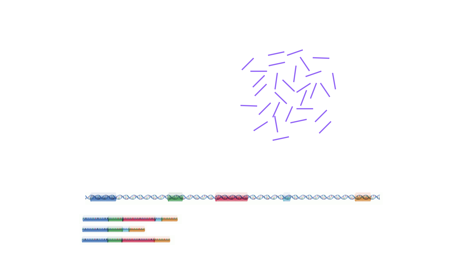
Image 1 of 1: ‘Illustration of a set of reads generated by a sequencer, and genomic and transcriptomic reference sequences’
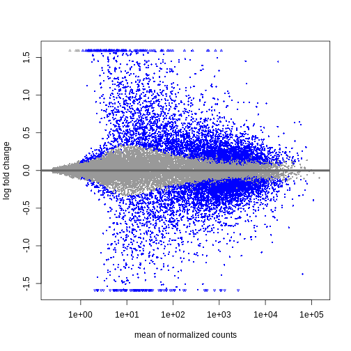
Image 1 of 2: ‘An example MA plot’
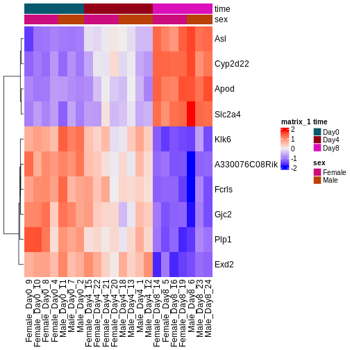
Image 2 of 2: ‘An example heatmap’
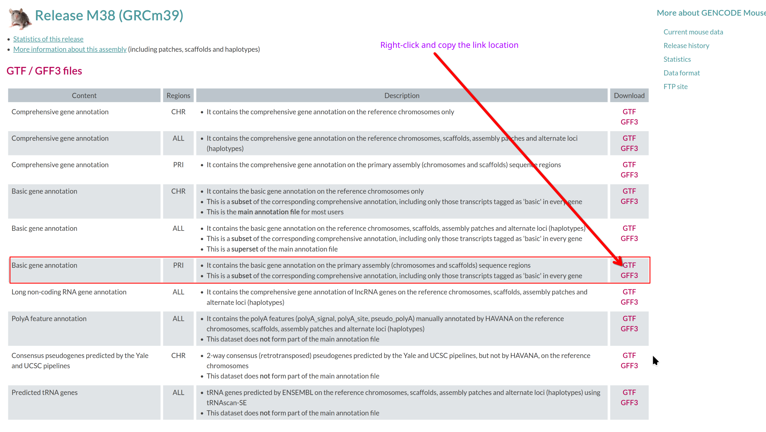
Image 1 of 1: ‘Basic gene annotation in GTF format’
Basic gene annotation in GTF format
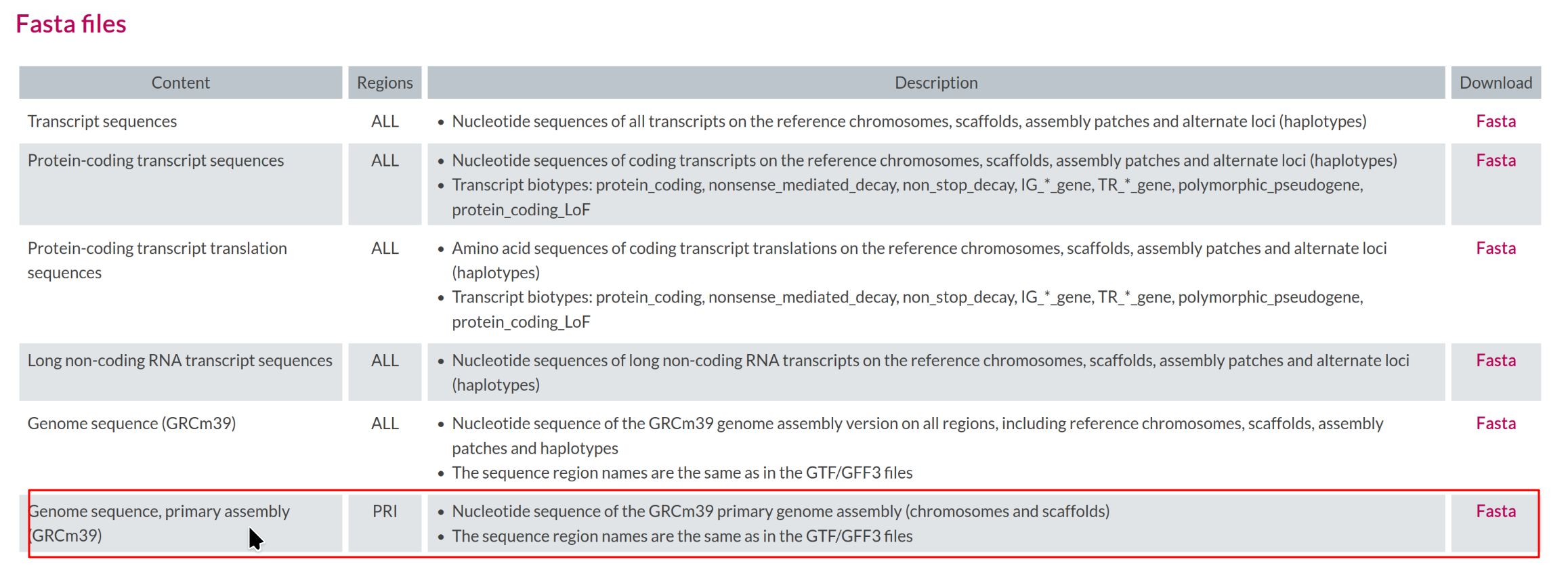
Image 1 of 1: ‘Reference genome file in FASTA format’
Reference genome file in FASTA format
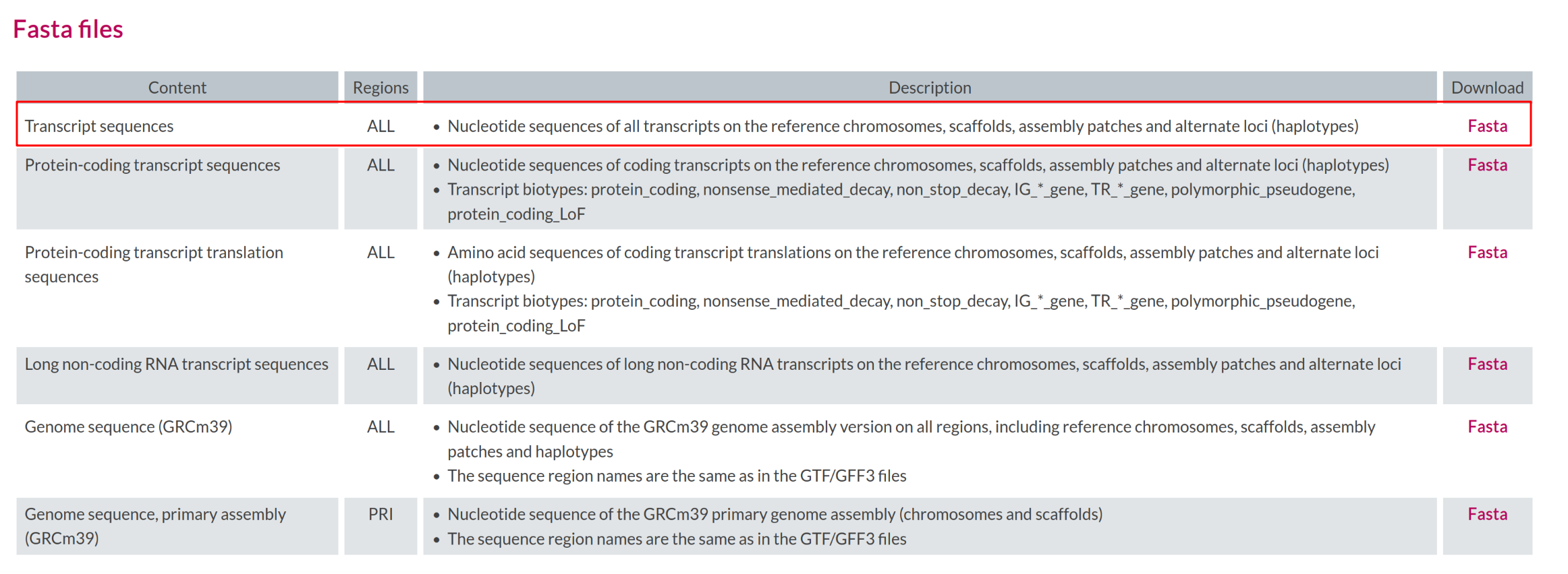
Image 1 of 1: ‘Transcript sequences file in FASTA format’
Transcript sequences file in FASTA format
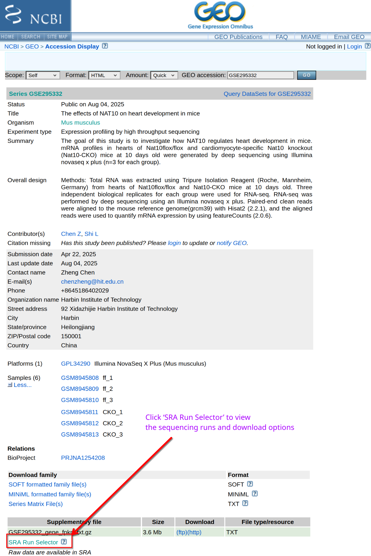
Image 1 of 1: ‘FASTQ files from GEO’
FASTQ files from GEO
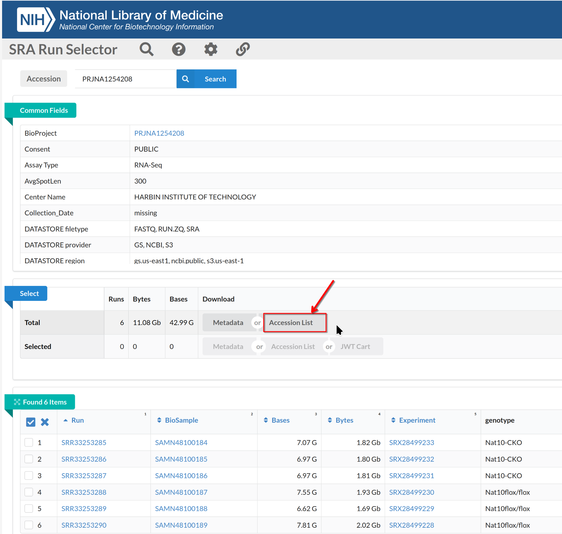
Image 1 of 1: ‘FASTQ files from SRA Run Selector’
FASTQ files from SRA Run Selector
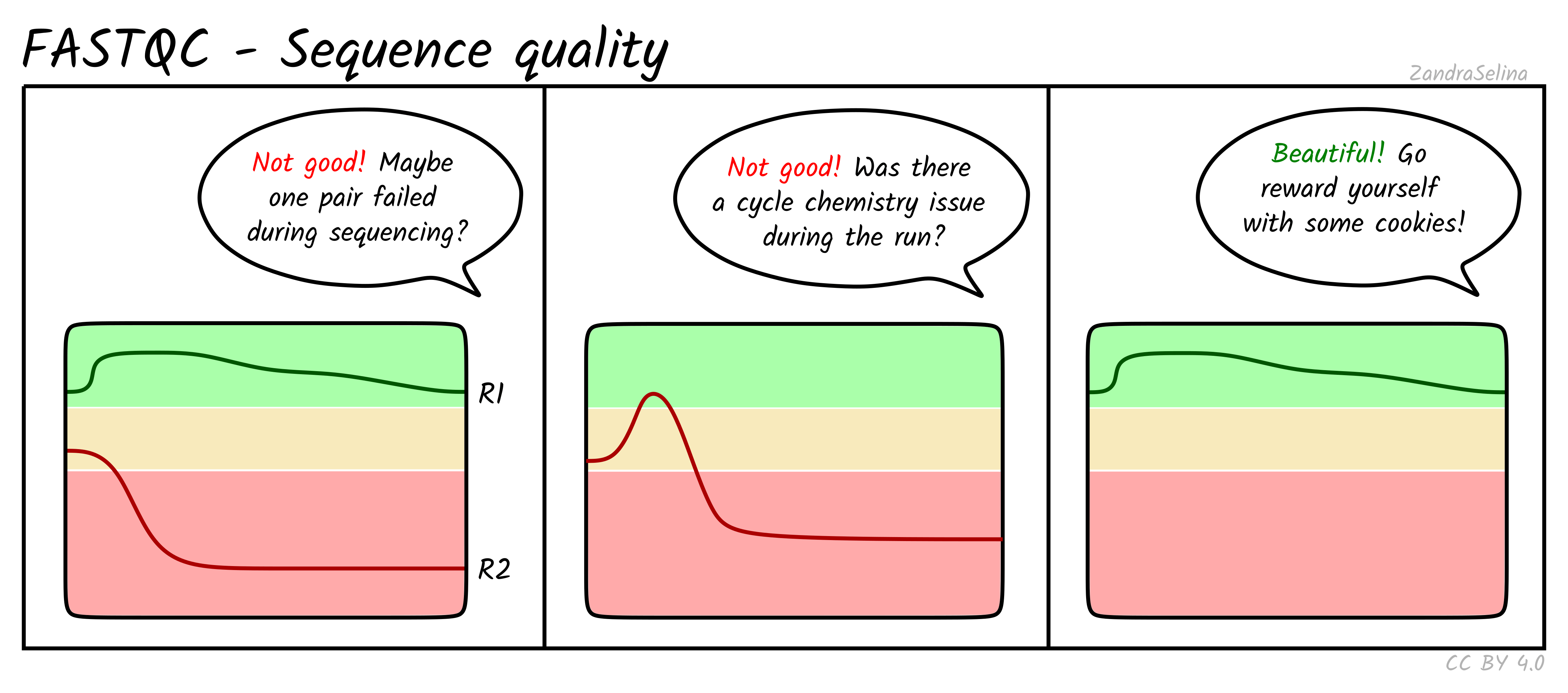
Image 1 of 1: ‘Per base sequence quality for a typical RNA-seq dataset’
Per base sequence quality for a typical RNA-seq dataset
Image 1 of 1: ‘Per tile sequence quality plot’
Per tile sequence quality plot
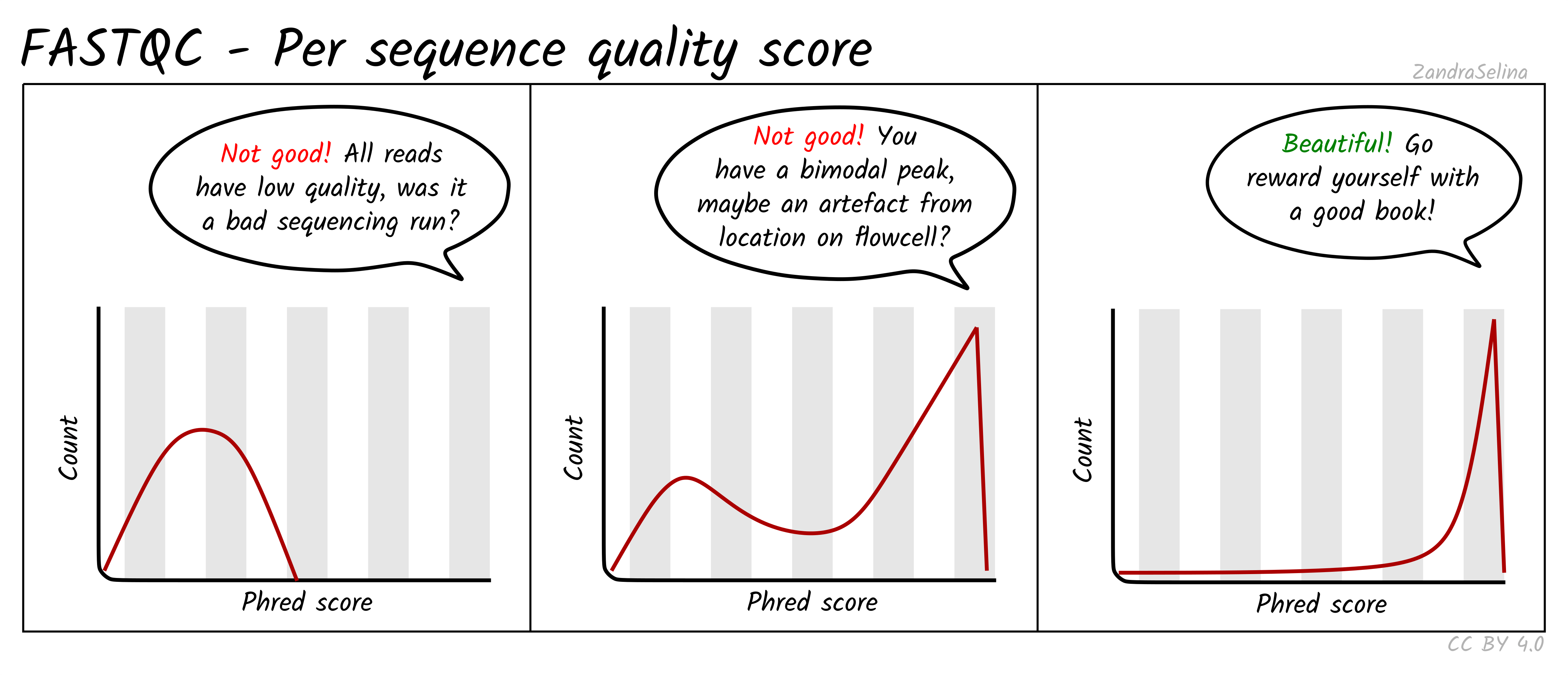
Image 1 of 1: ‘Distribution of per sequence quality scores’
Distribution of per sequence quality scores
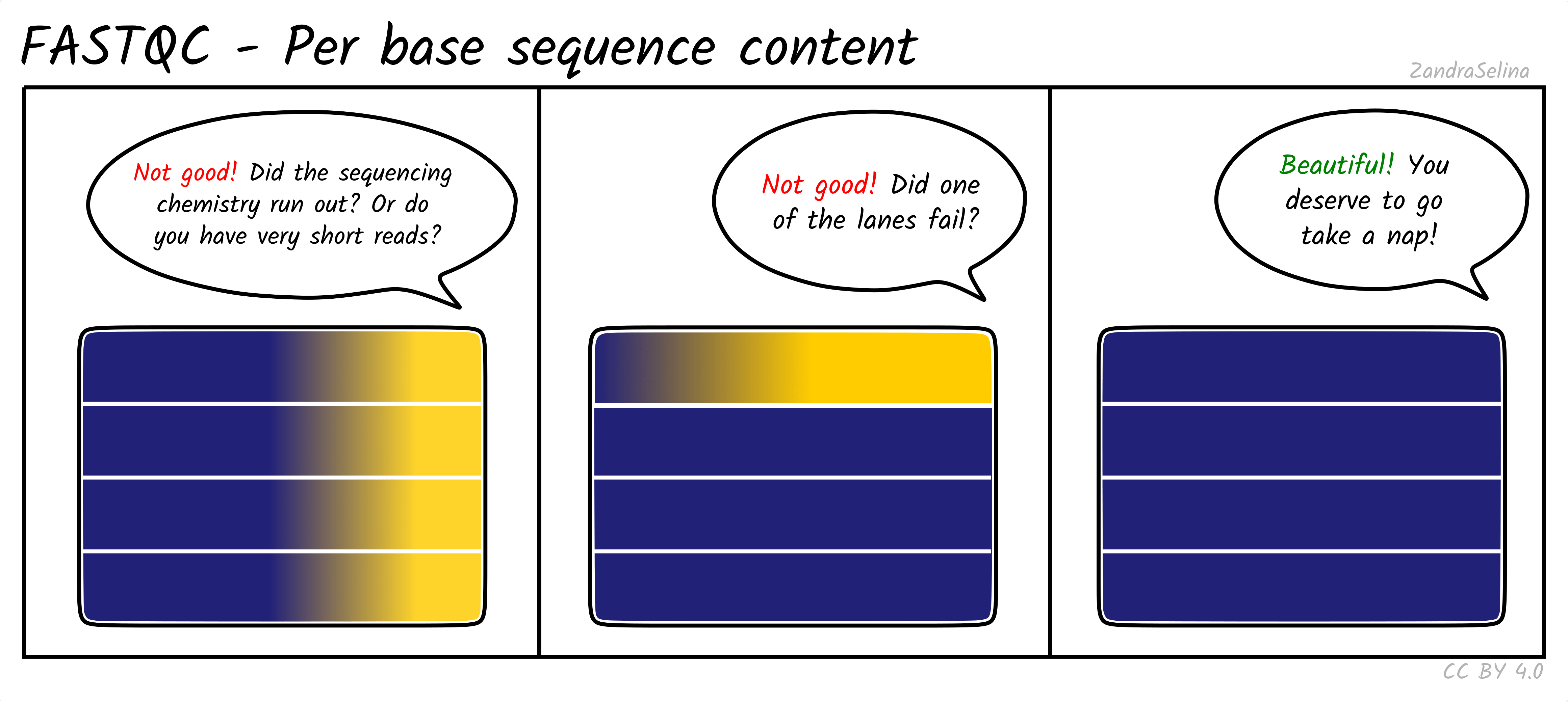
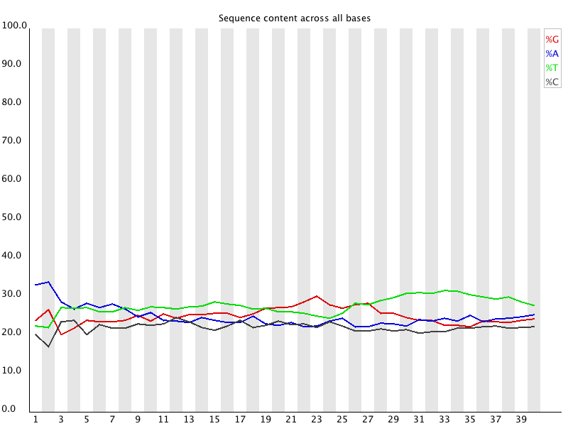
Image 1 of 1: ‘Per base sequence content for RNA-seq reads’
Per base sequence content for RNA-seq reads
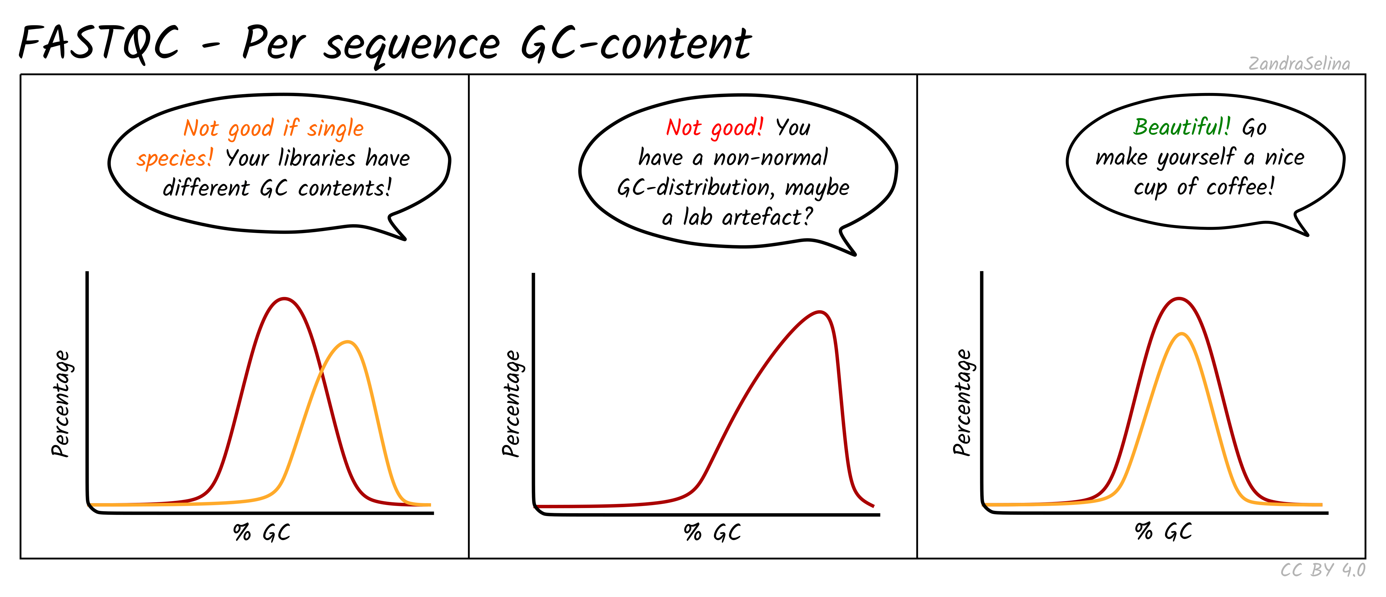
Image 1 of 1: ‘Per sequence GC content distribution’
Per sequence GC content distribution
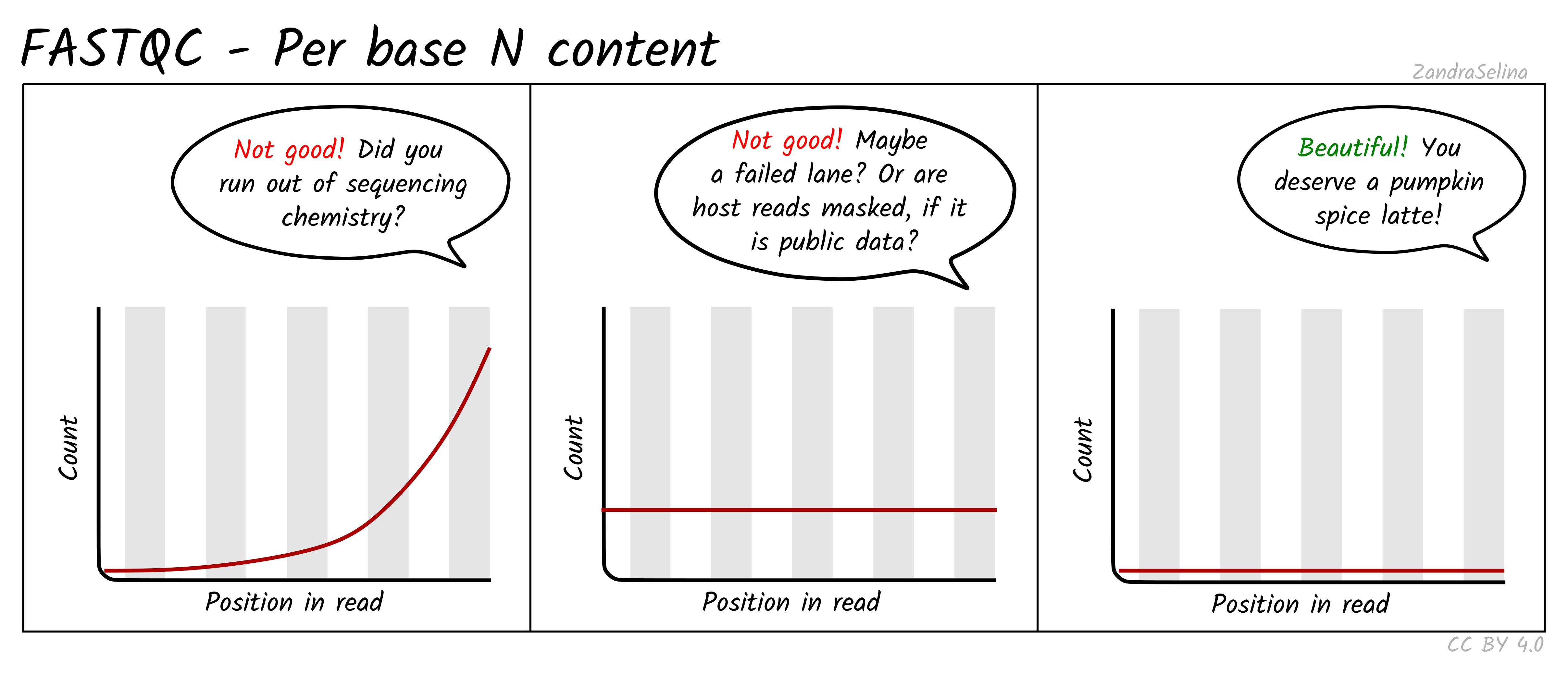
Image 1 of 1: ‘Per base N content plot’
Per base N content plot
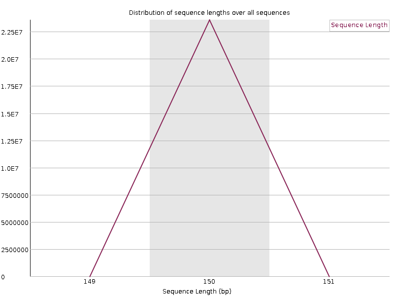
Image 1 of 1: ‘Sequence length distribution for RNA-seq data’
Sequence length distribution for RNA-seq data
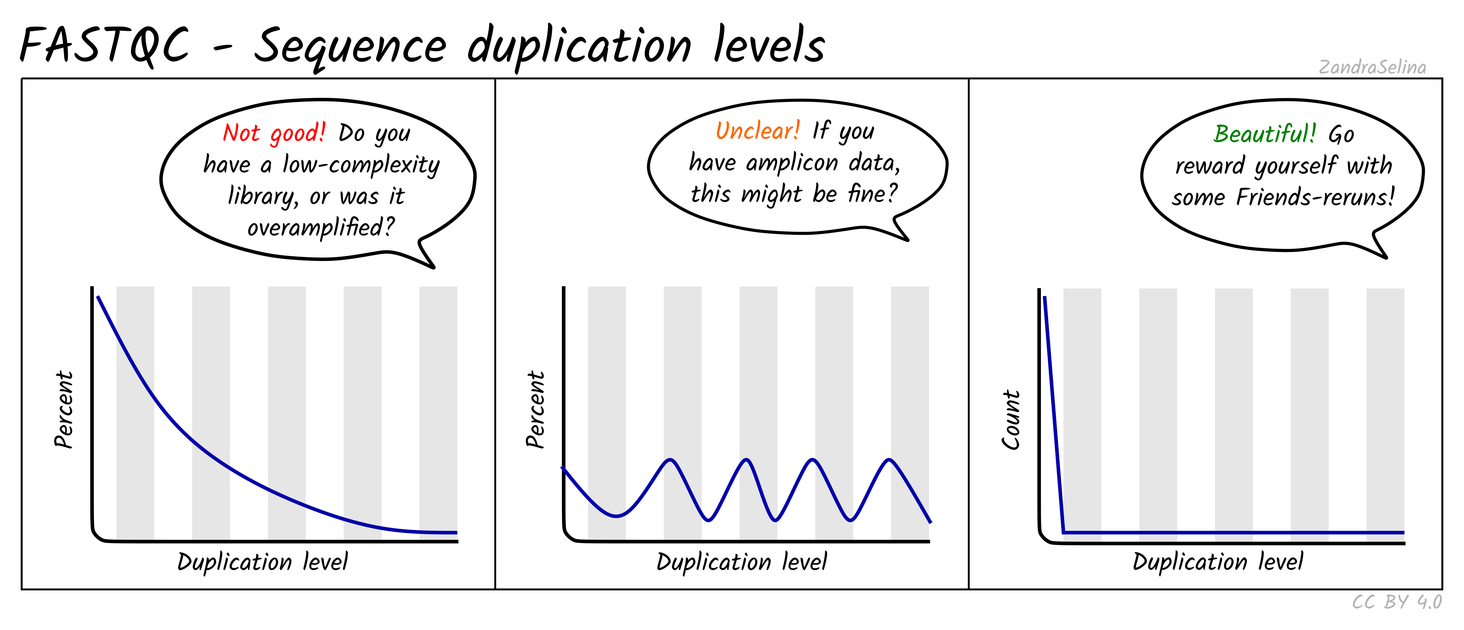
Image 1 of 1: ‘Sequence duplication levels’
Sequence duplication levels
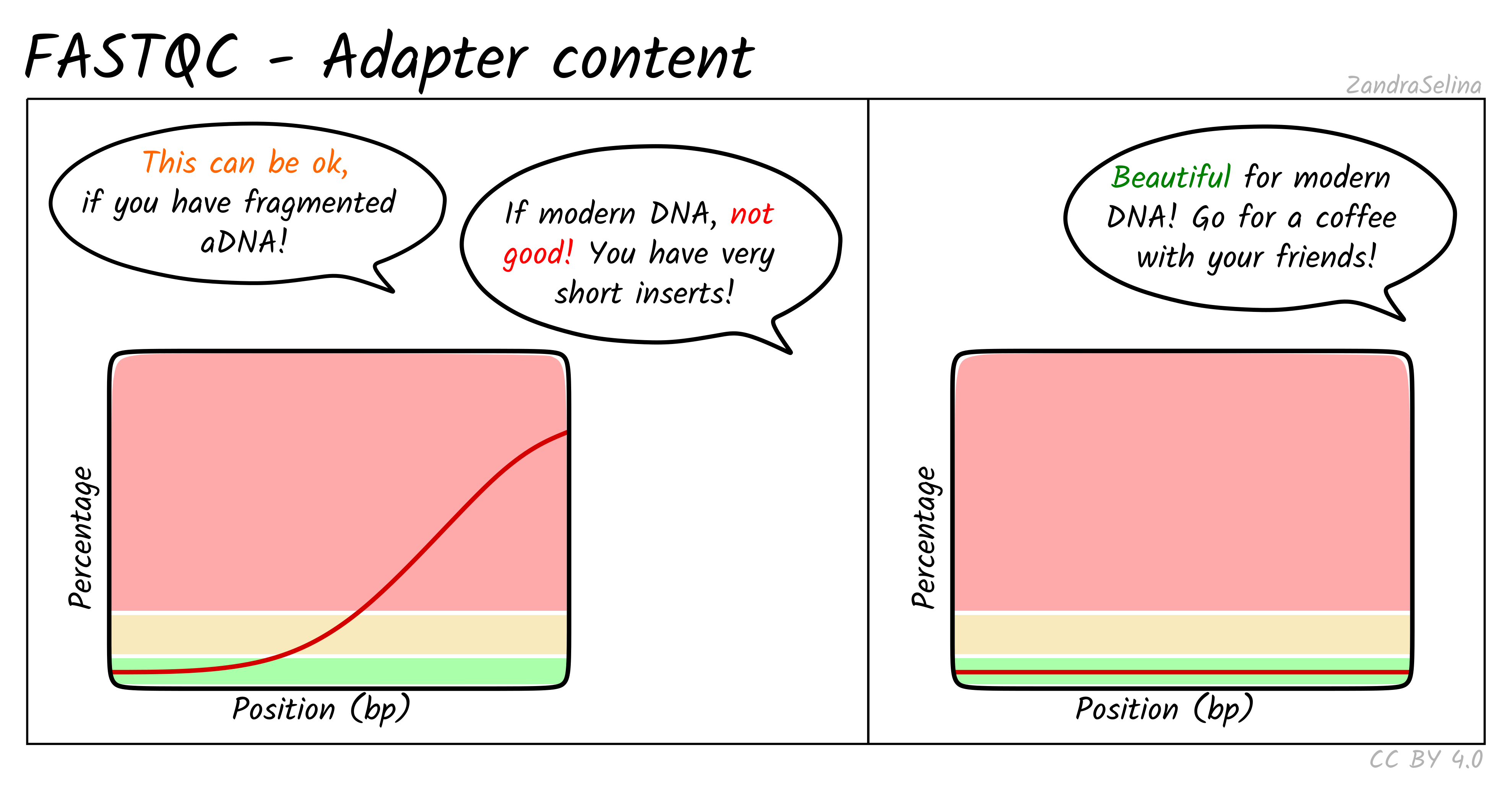
Image 1 of 1: ‘Adapter content across the read’
Adapter content across the read
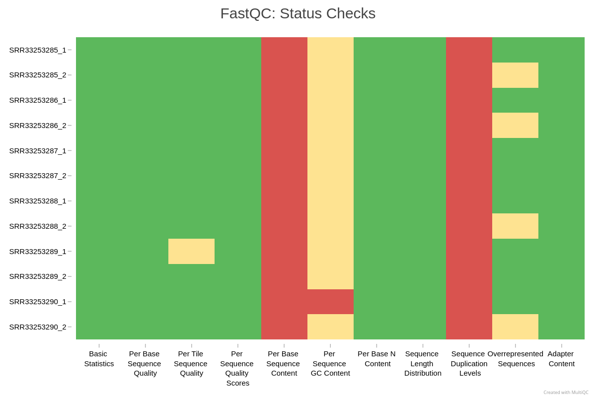
Image 1 of 1: ‘Example MultiQC summary across all samples’
Example MultiQC summary across all samples
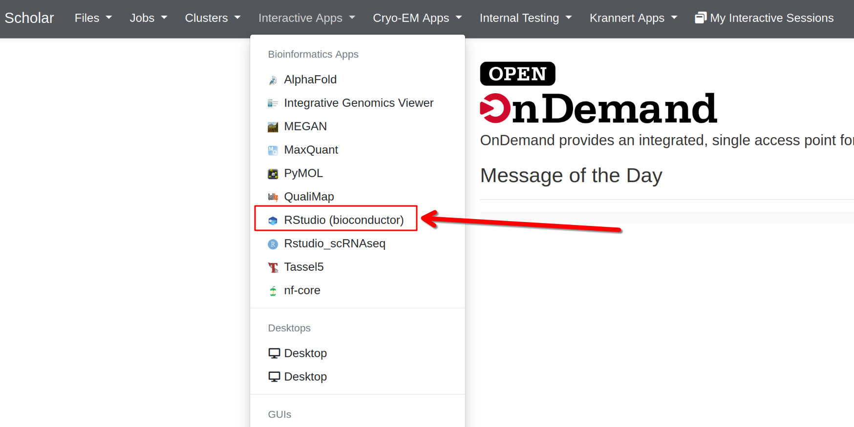
Image 1 of 1: ‘Open OnDemand interface’
Open OnDemand interface
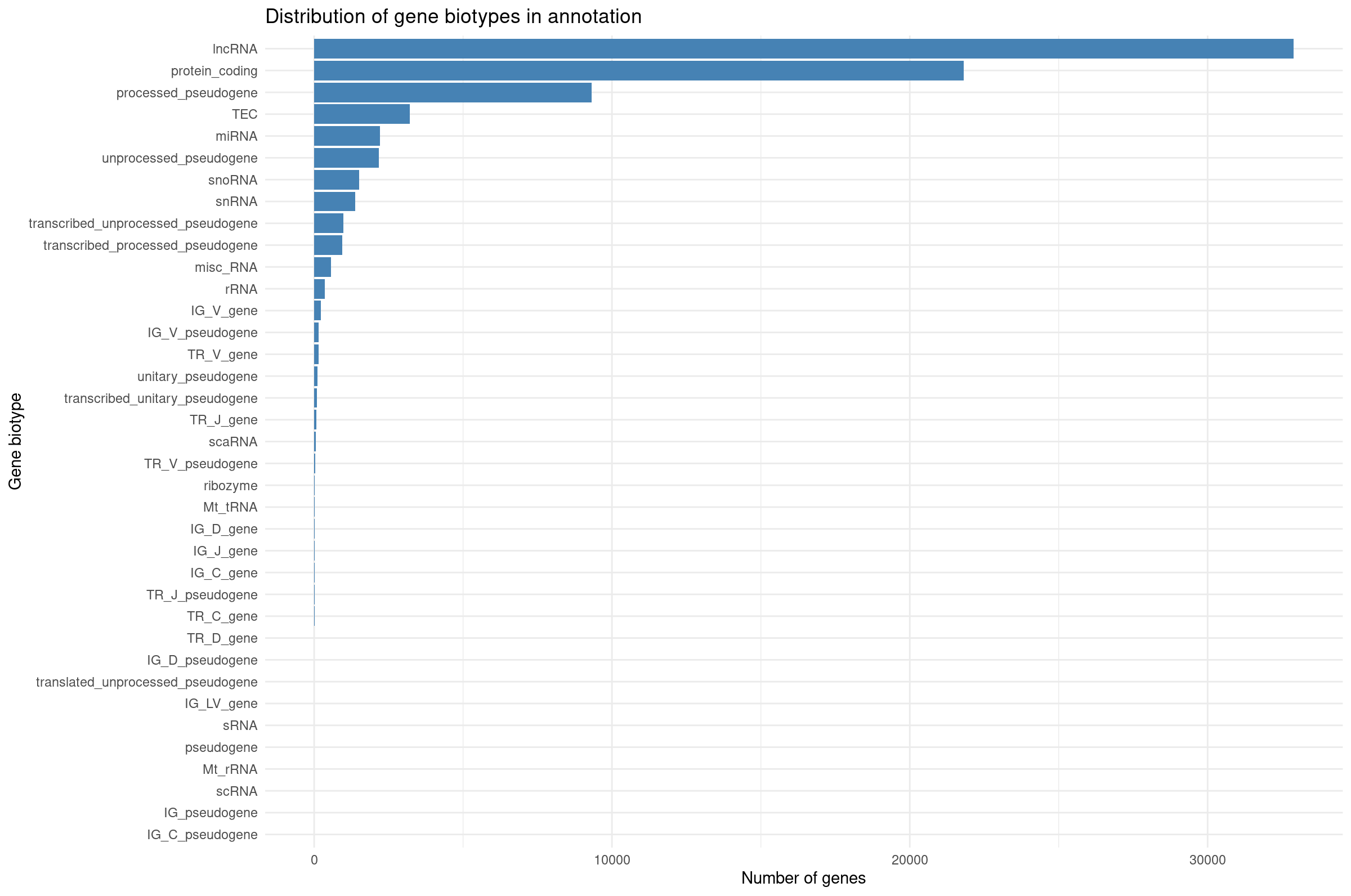
Image 1 of 1: ‘Distribution of gene biotypes in annotation’
Distribution of gene biotypes in annotation
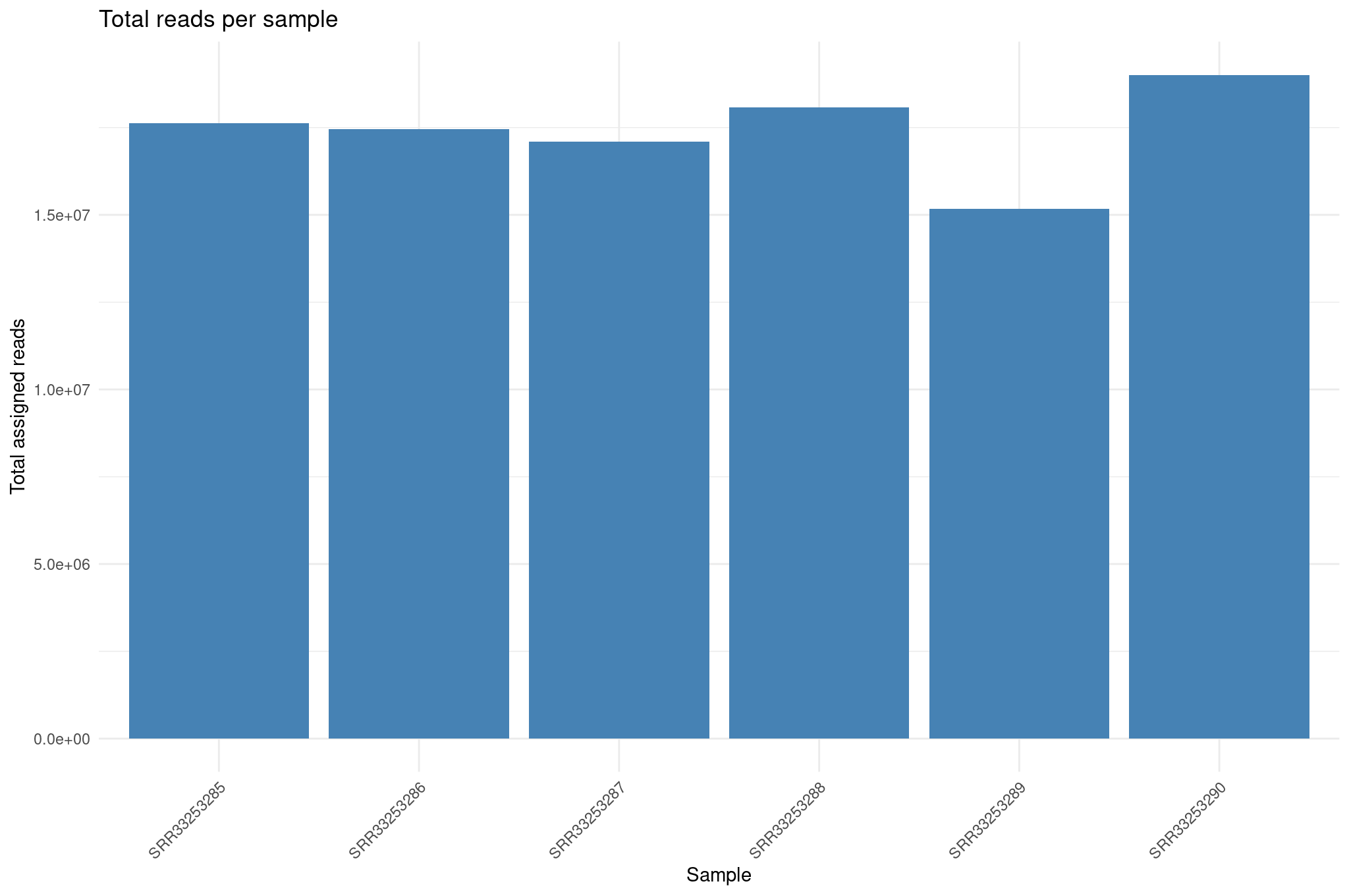
Image 1 of 1: ‘Total assigned reads per sample’
Total assigned reads per sample
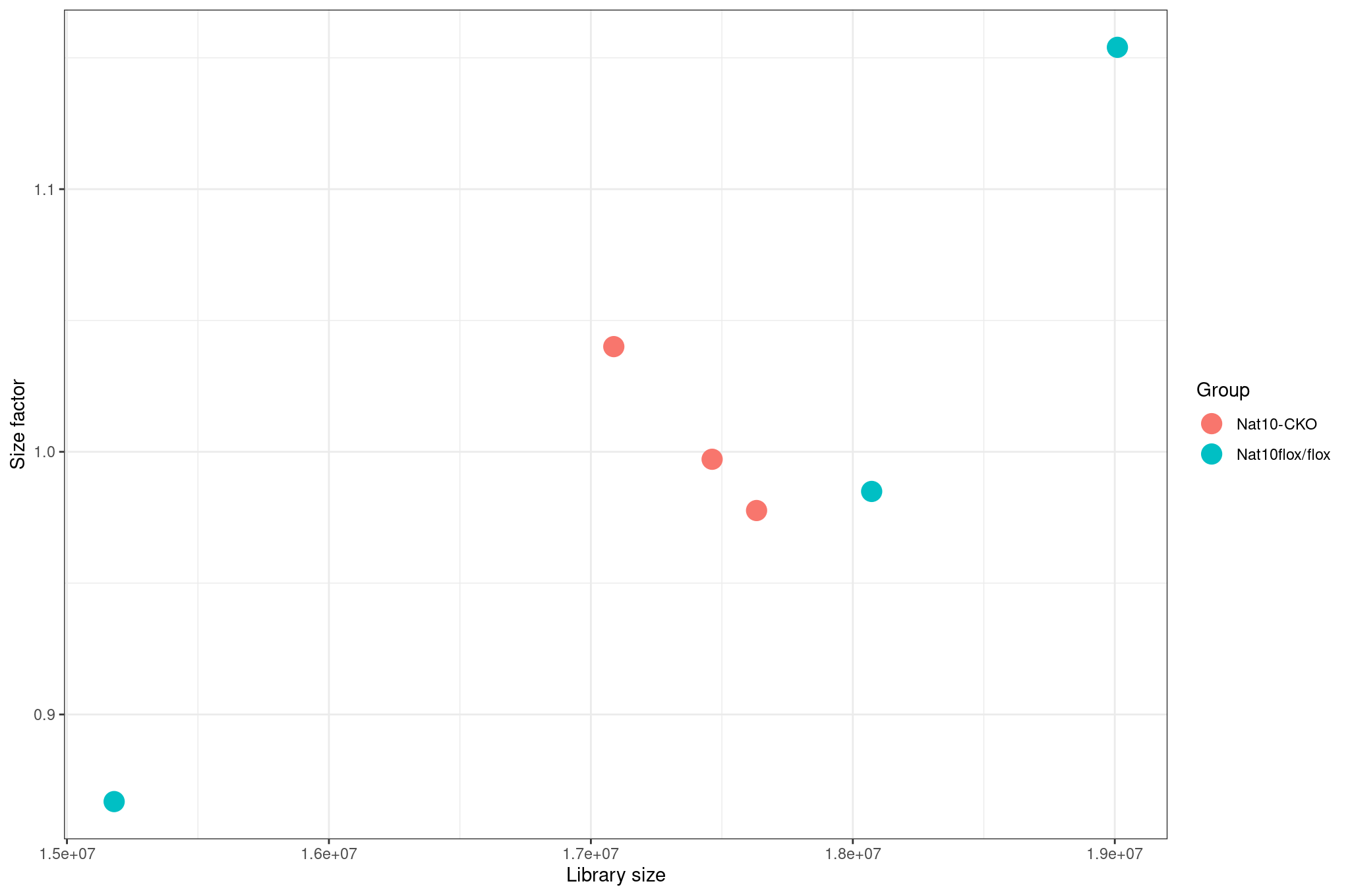
Image 1 of 1: ‘Size factors vs library size’
Size factors vs library size
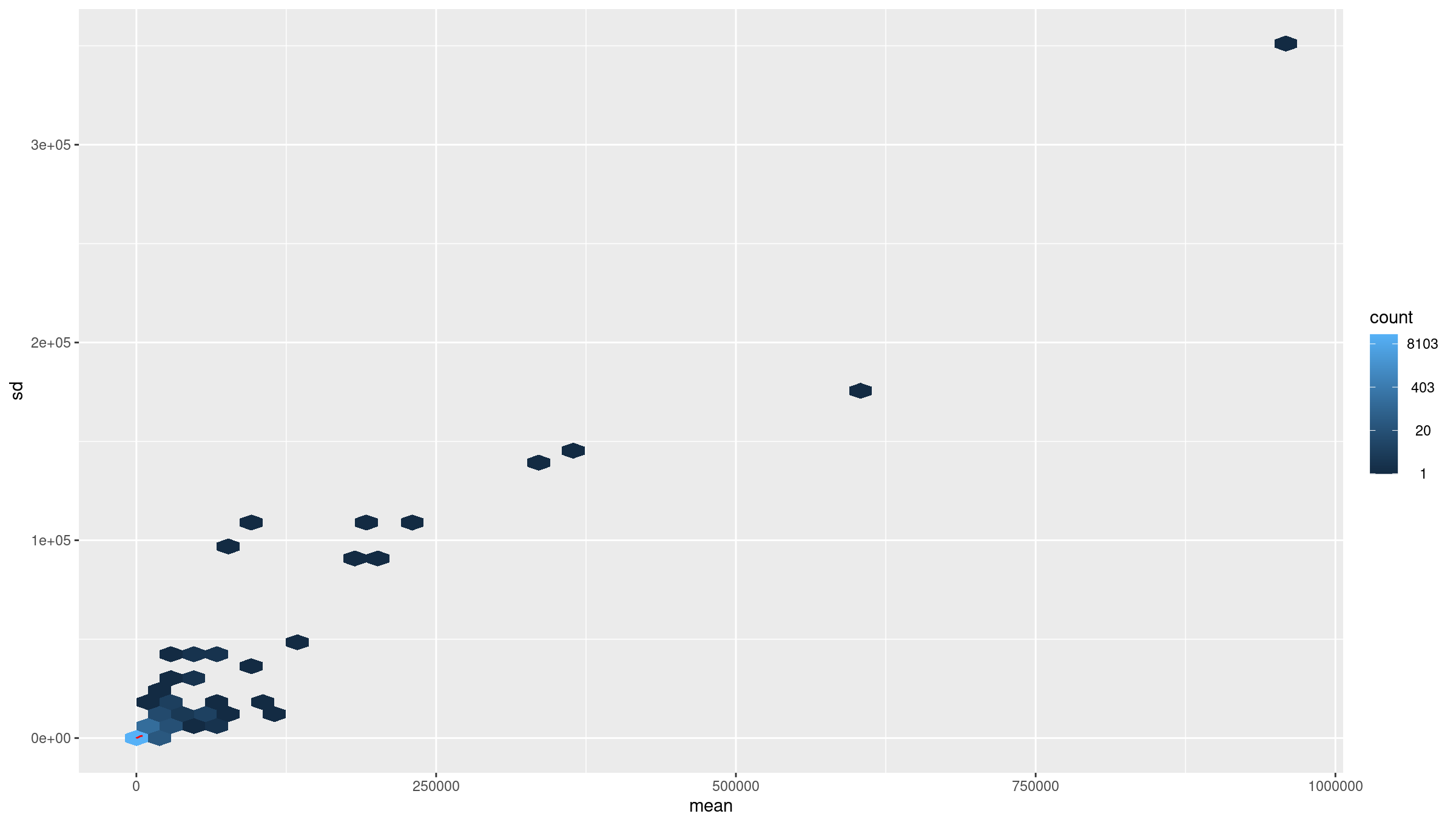
Image 1 of 1: ‘Average counts vs variance before transformation’
Average counts vs variance before transformation
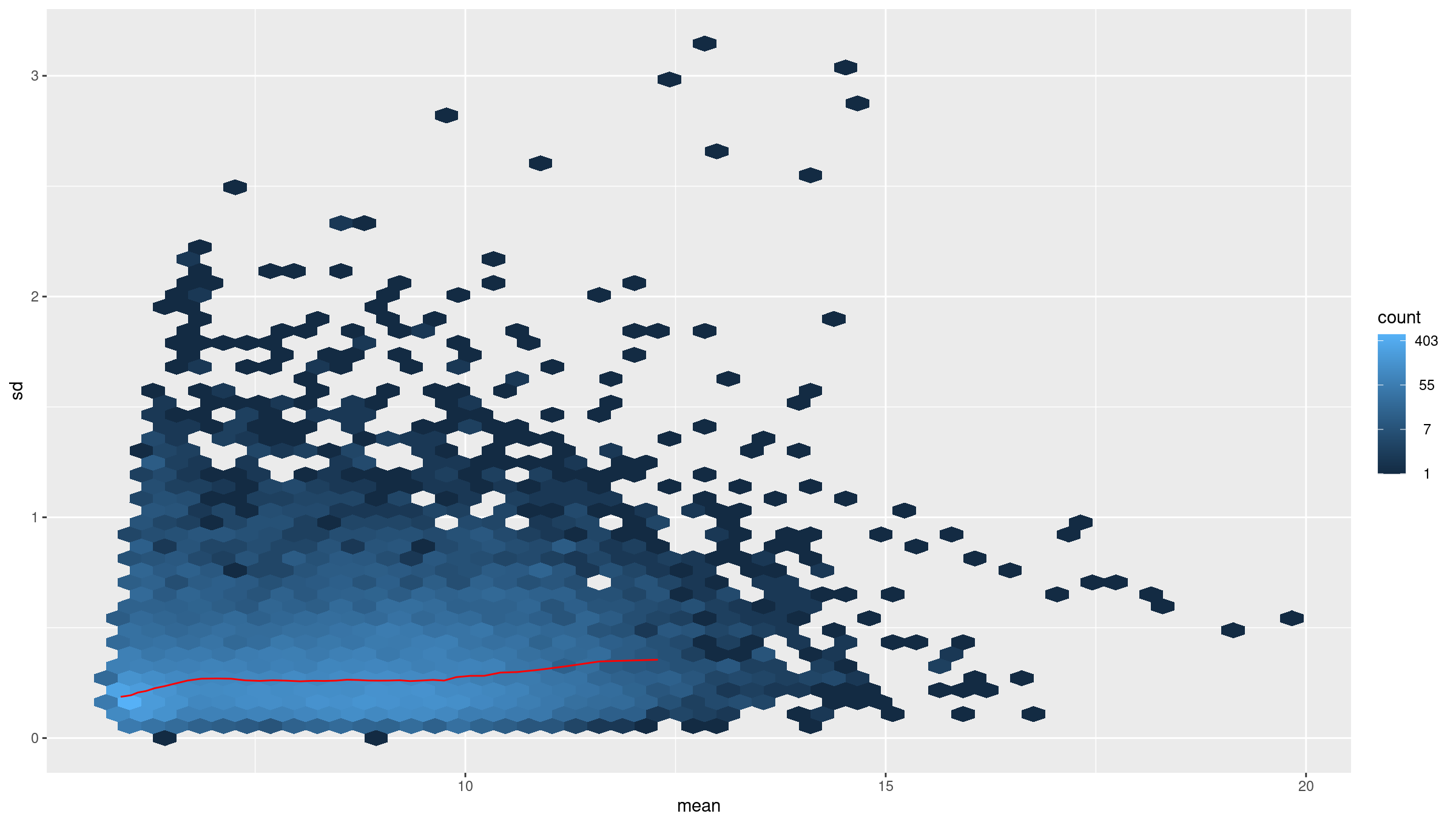
Image 1 of 1: ‘average counts vs variance after transformation’
average counts vs variance after transformation
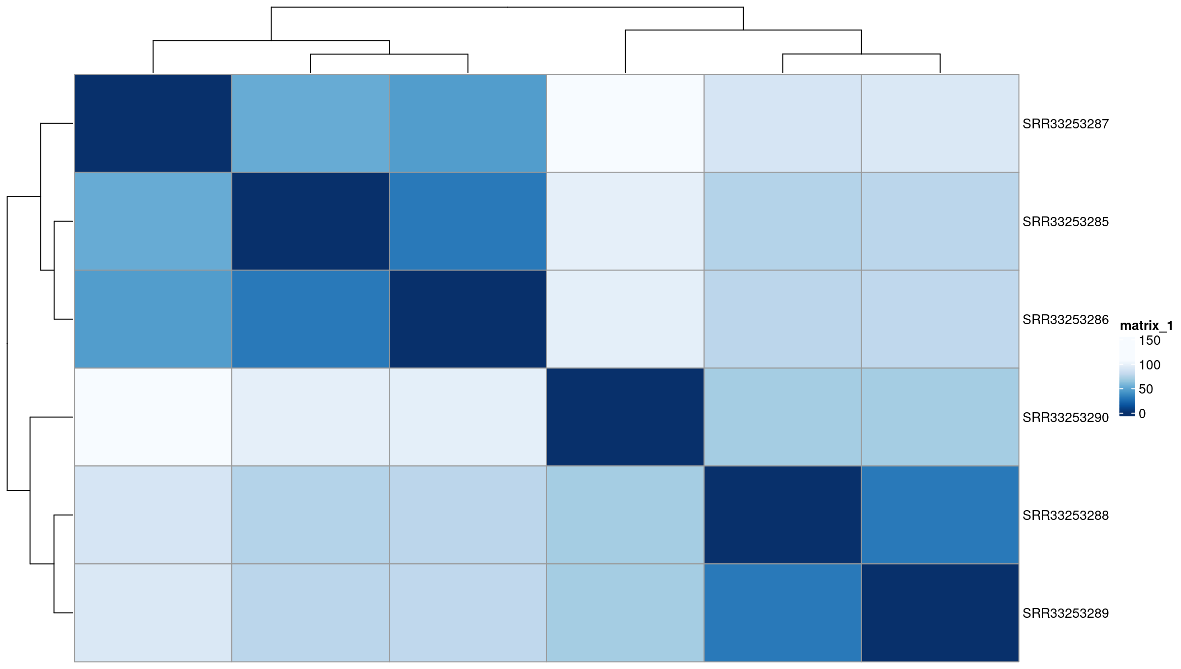
Image 1 of 1: ‘Euclidean distance heatmap’
Euclidean distance heatmap
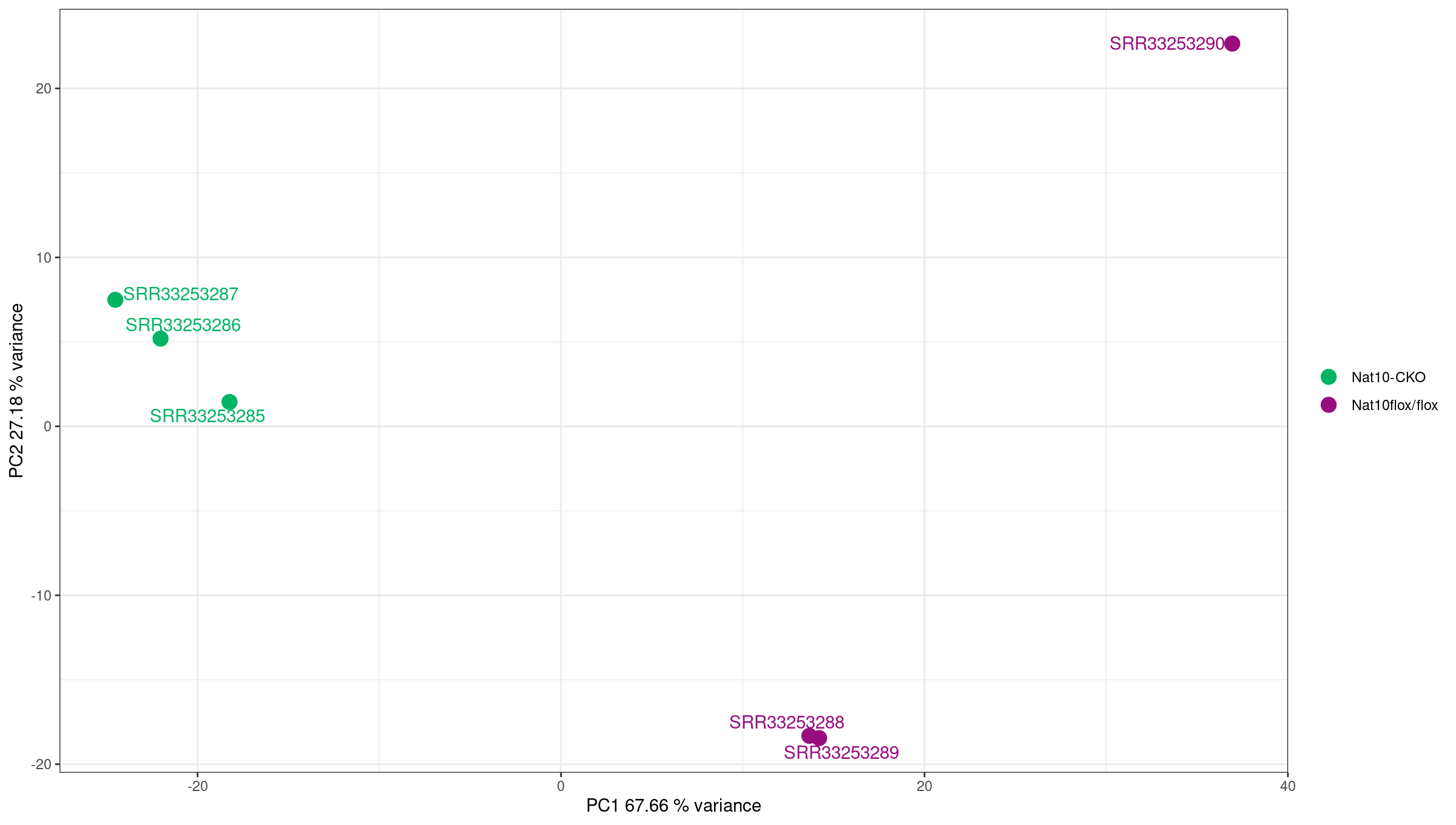
Image 1 of 1: ‘PCA plot showing sample clustering’
PCA plot showing sample clustering
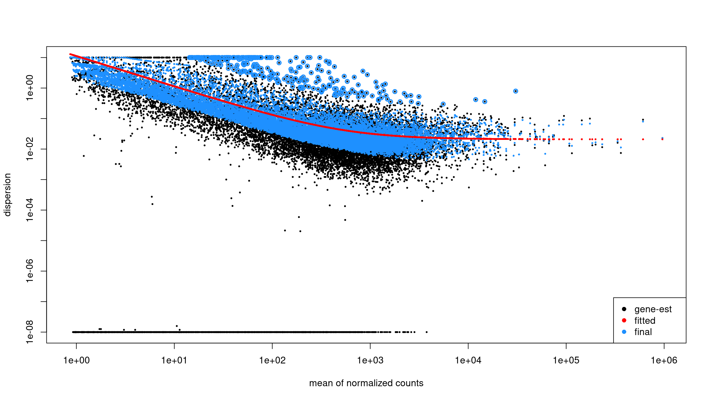
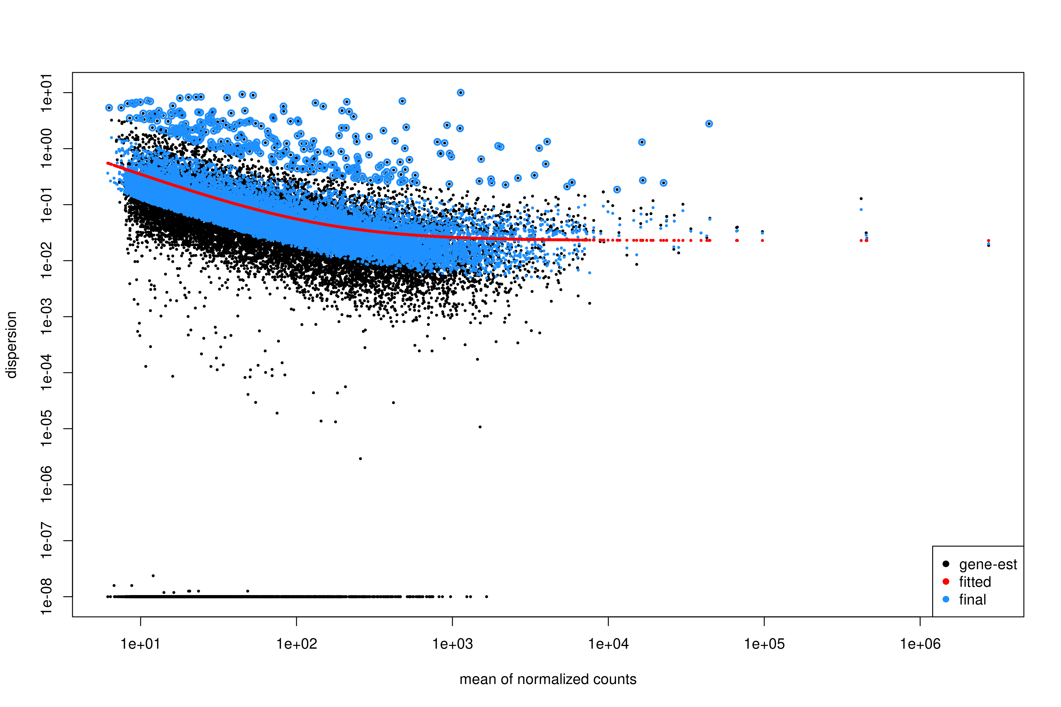
Image 1 of 1: ‘Dispersion estimates from DESeq2’
Dispersion estimates from DESeq2
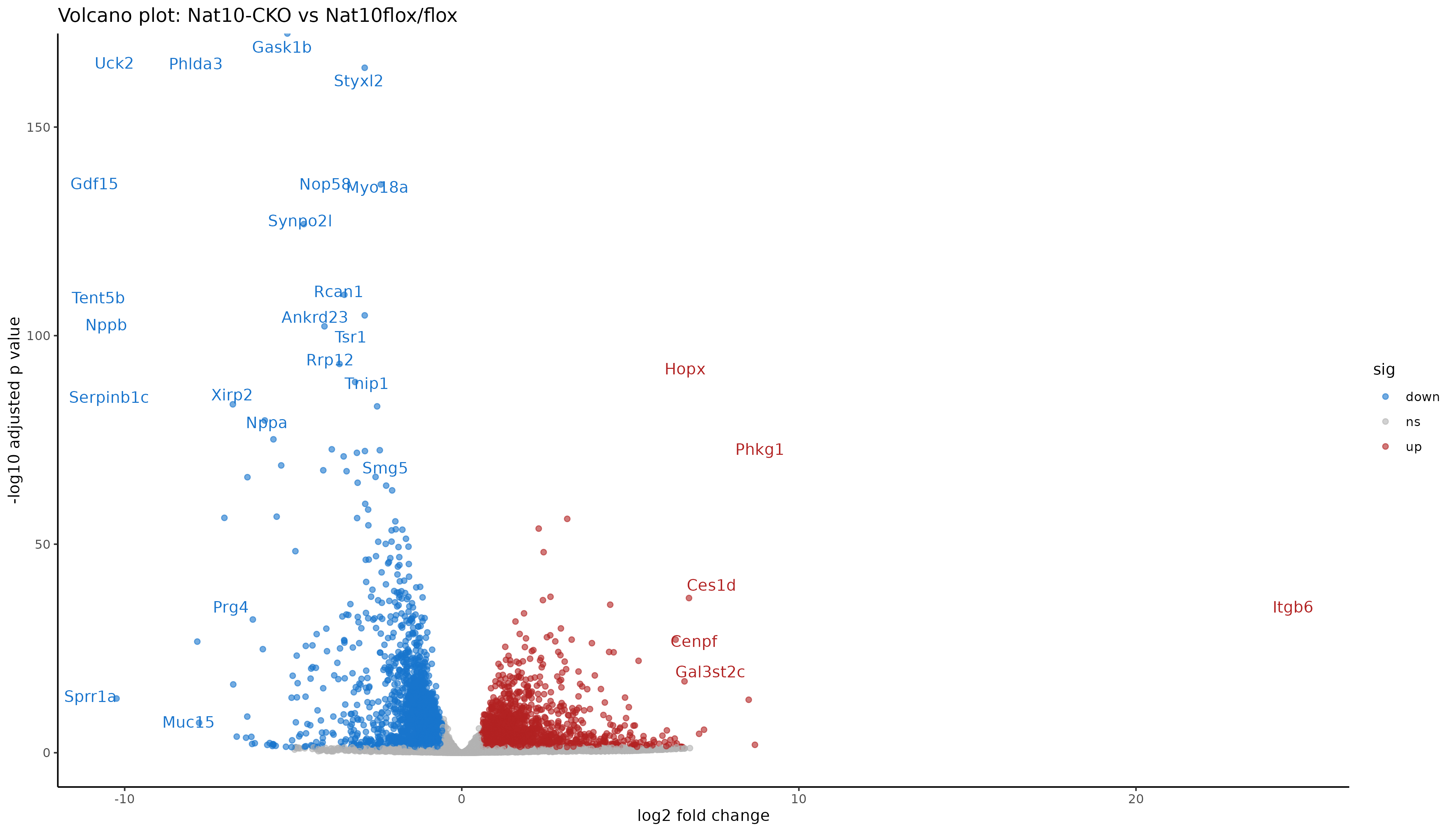
Image 1 of 1: ‘Volcano plot of differential expression results’
Volcano plot of differential expression results
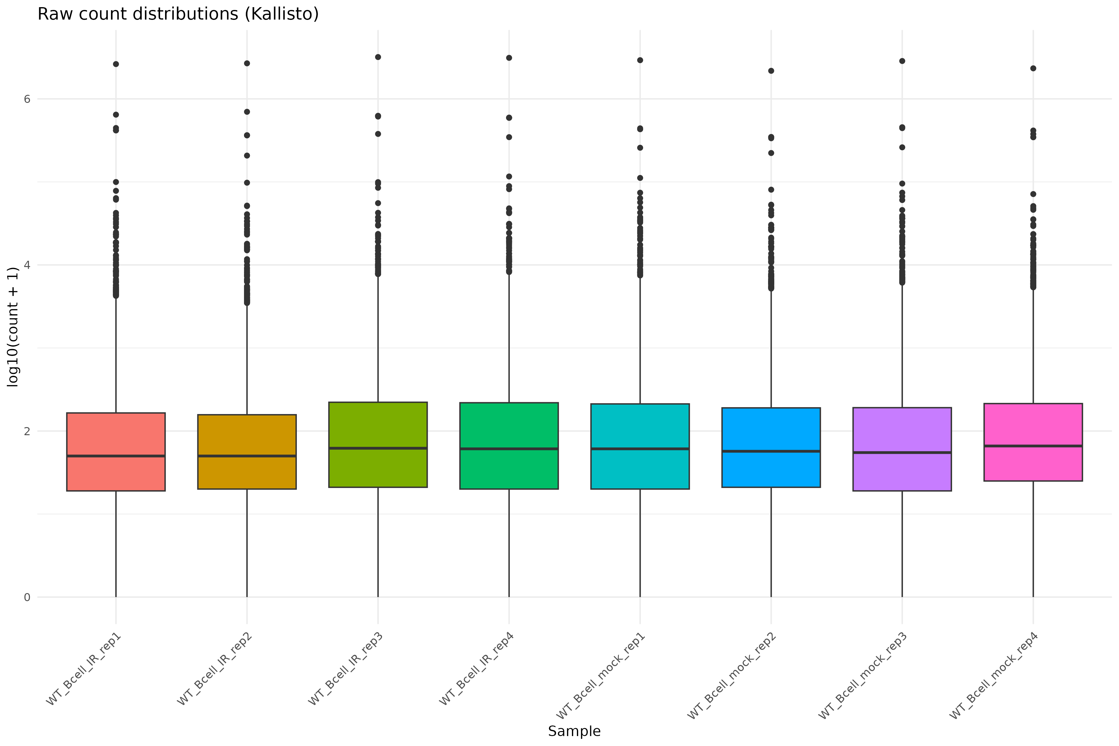
Image 1 of 1: ‘Raw count distributions’
Raw count distributions
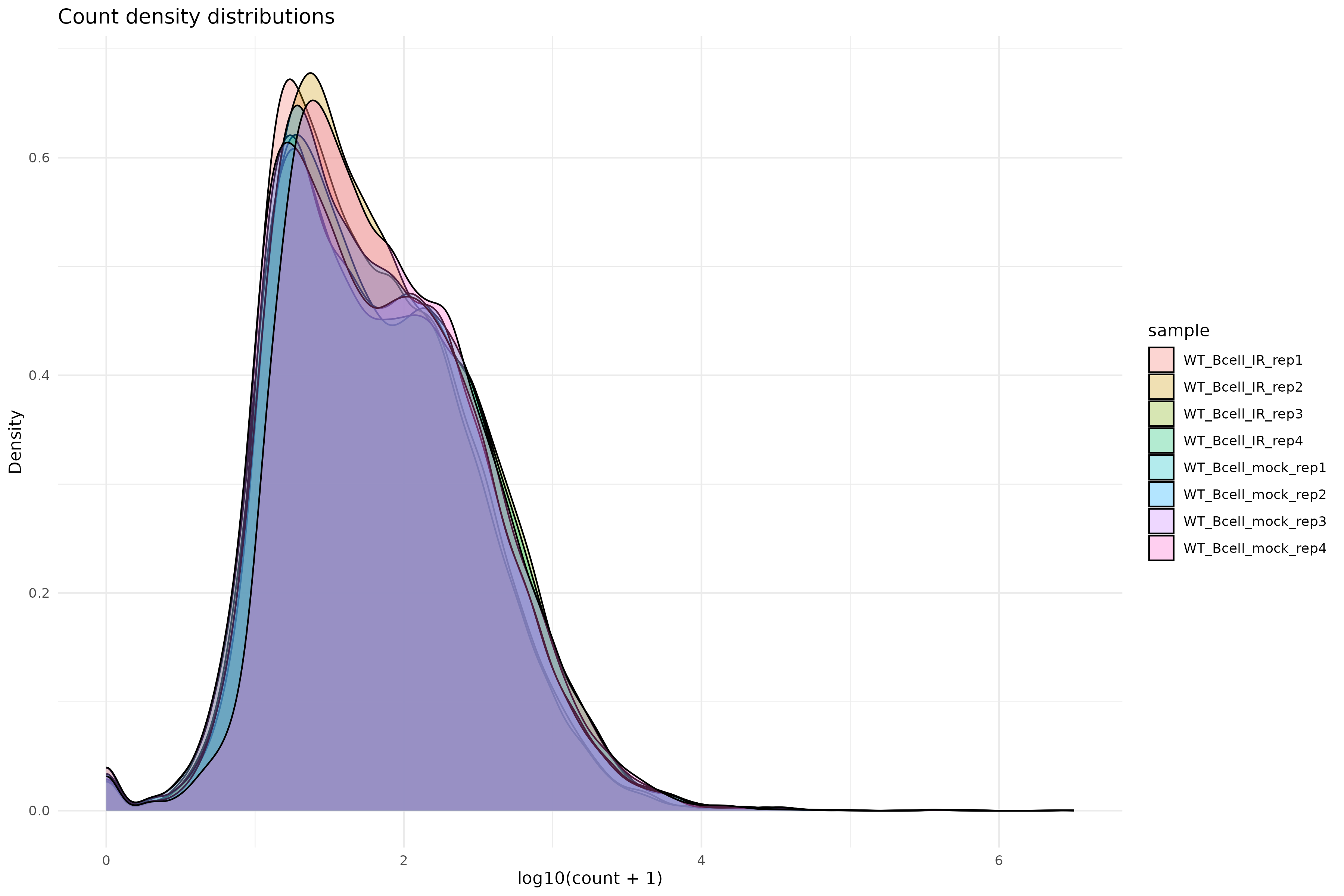
Image 1 of 1: ‘Count density distributions’
Count density distributions
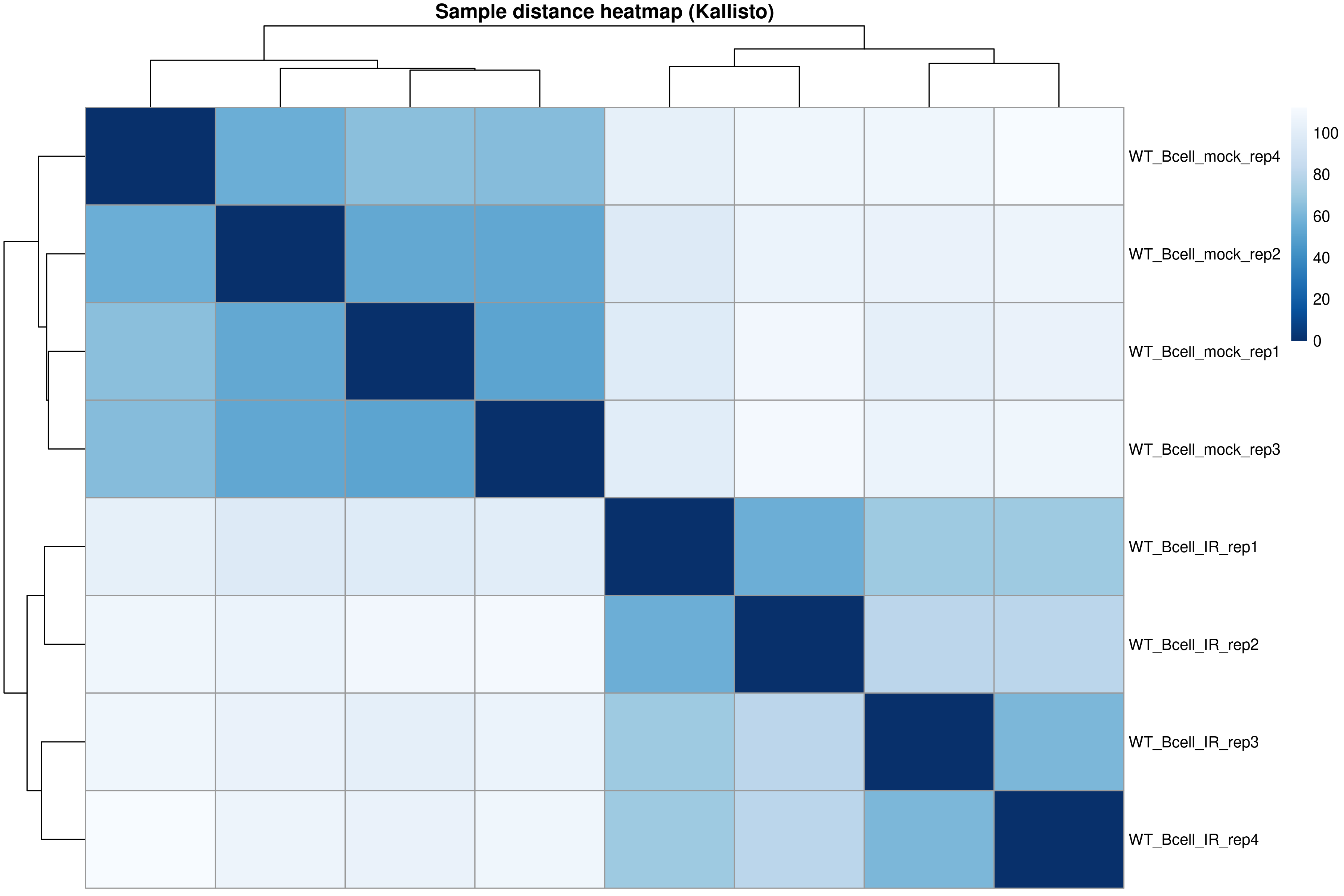
Image 1 of 1: ‘Sample distance heatmap’
Sample distance heatmap
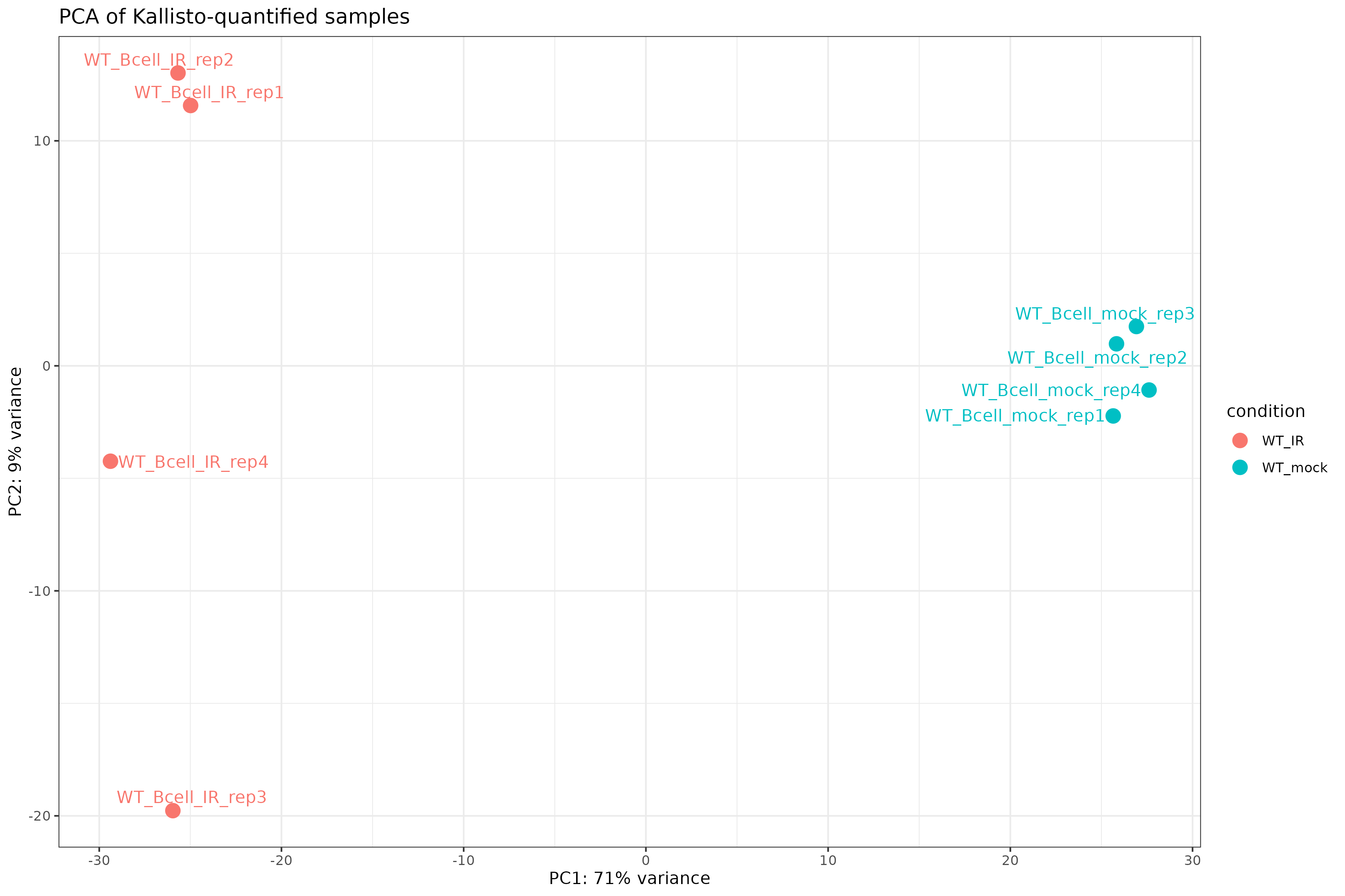
Image 1 of 1: ‘PCA plot of Kallisto-quantified samples’
PCA plot of Kallisto-quantified samples
Image 1 of 1: ‘Volcano plot of differential expression results’
Volcano plot of differential expression results
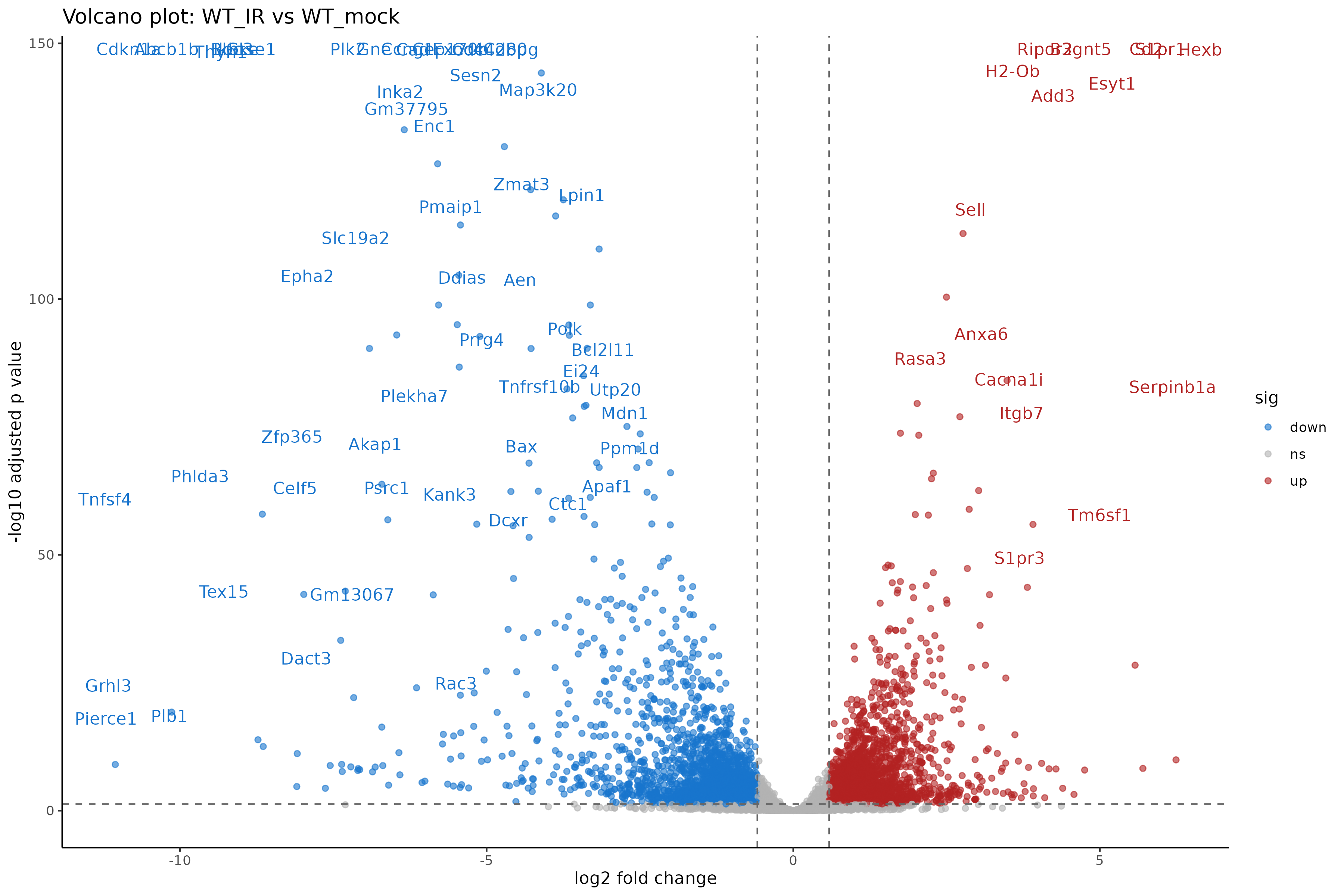
Image 1 of 1: ‘Volcano plot of differential expression results’
Volcano plot of differential expression results
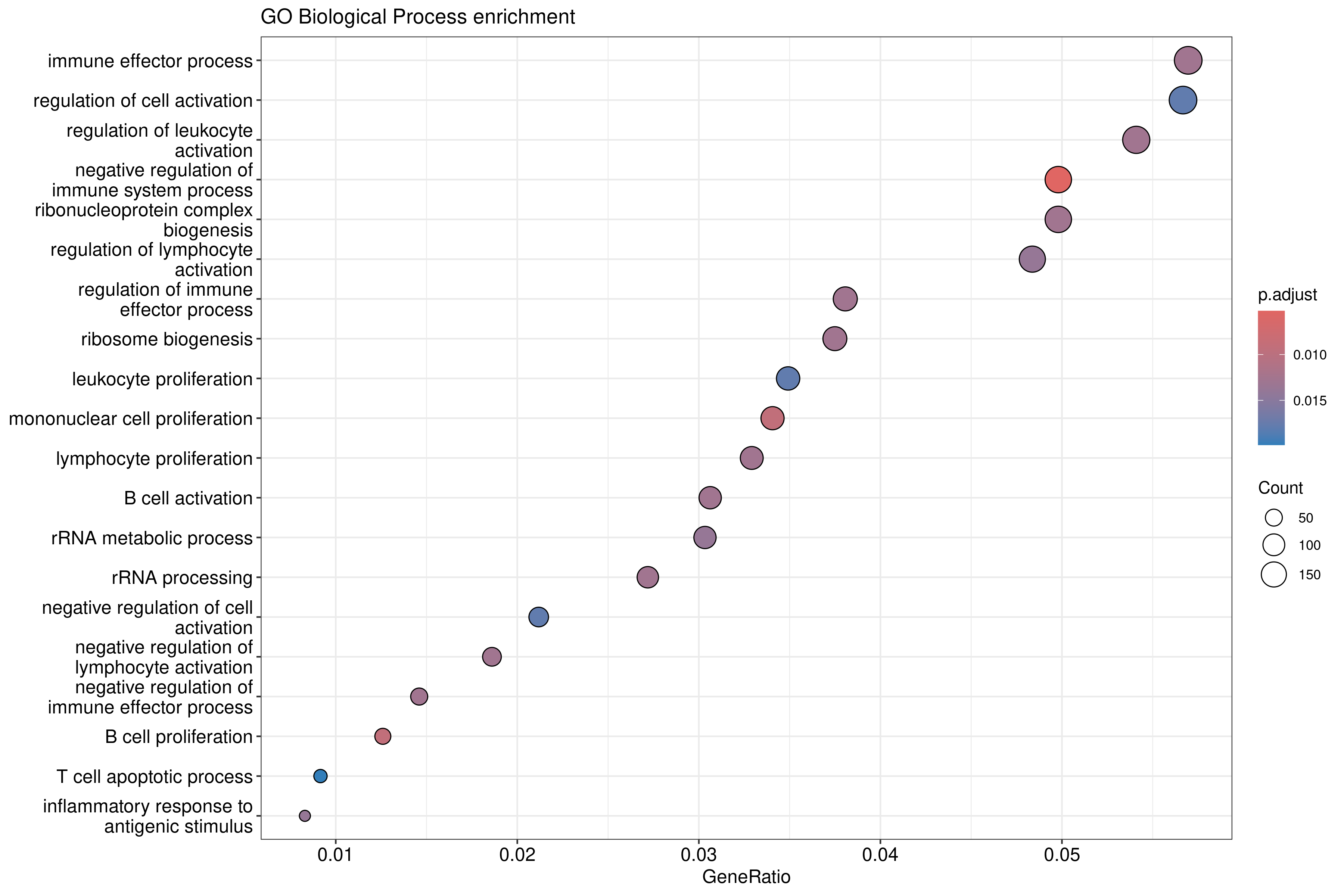
Image 1 of 1: ‘GO Biological Process enrichment dotplot for upregulated genes’
GO Biological Process enrichment dotplot for upregulated genes
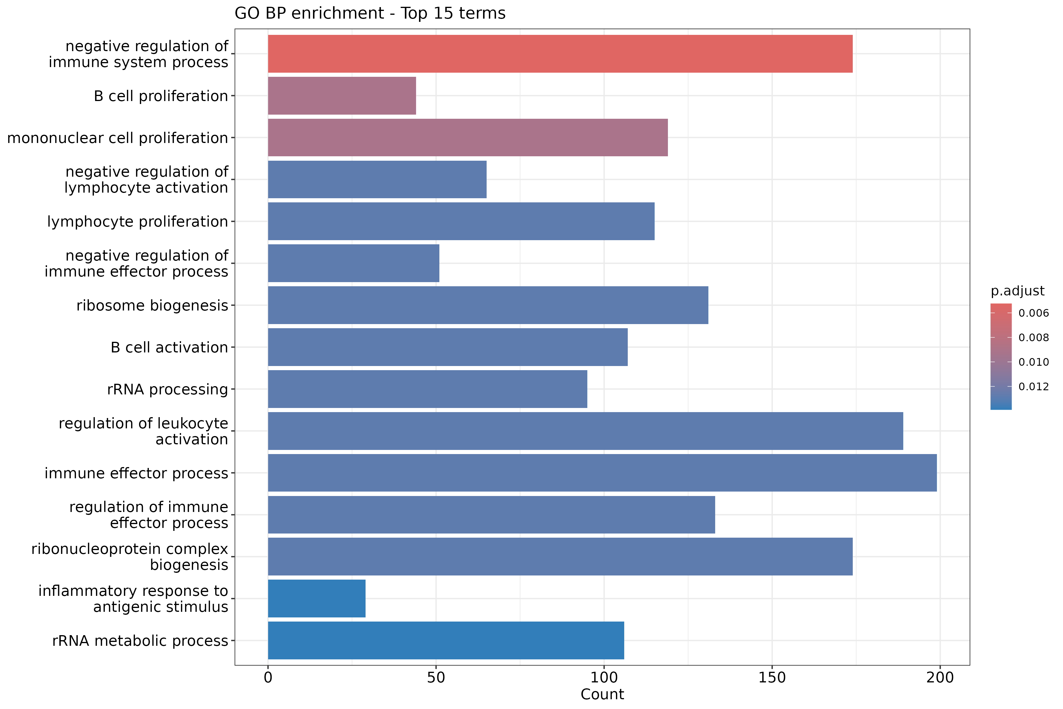
Image 1 of 1: ‘GO Biological Process enrichment barplot for upregulated genes’
GO Biological Process enrichment barplot for upregulated genes
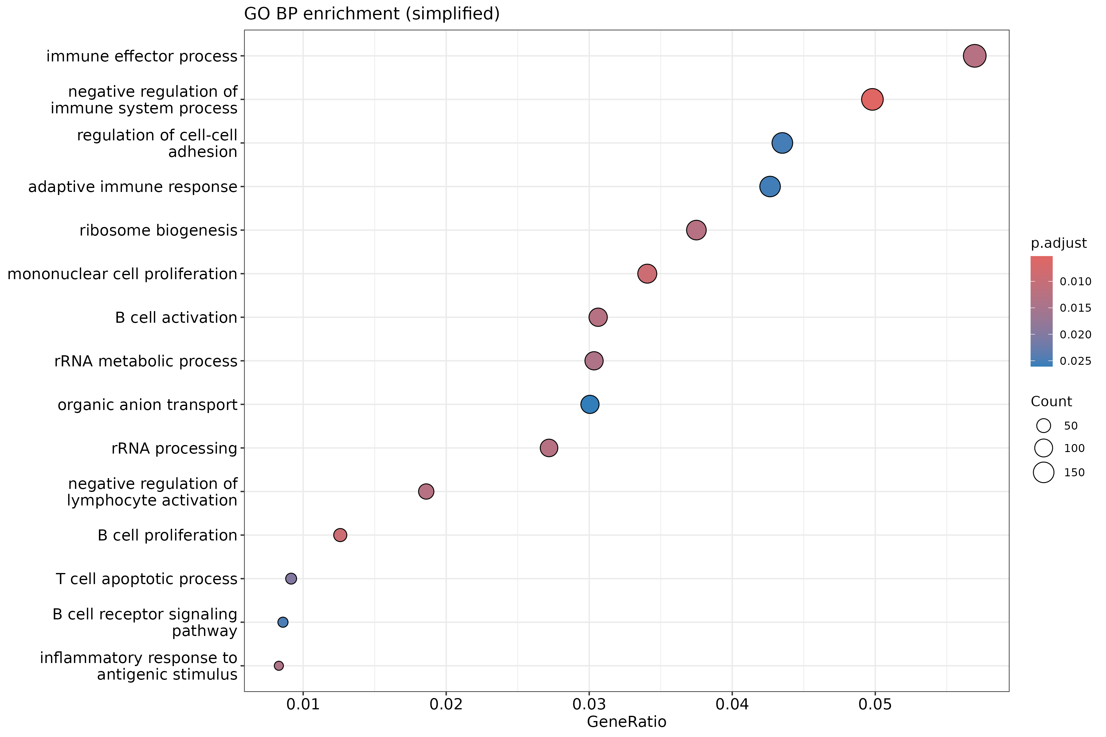
Image 1 of 1: ‘Simplified GO Biological Process enrichment dotplot’
Simplified GO Biological Process enrichment dotplot
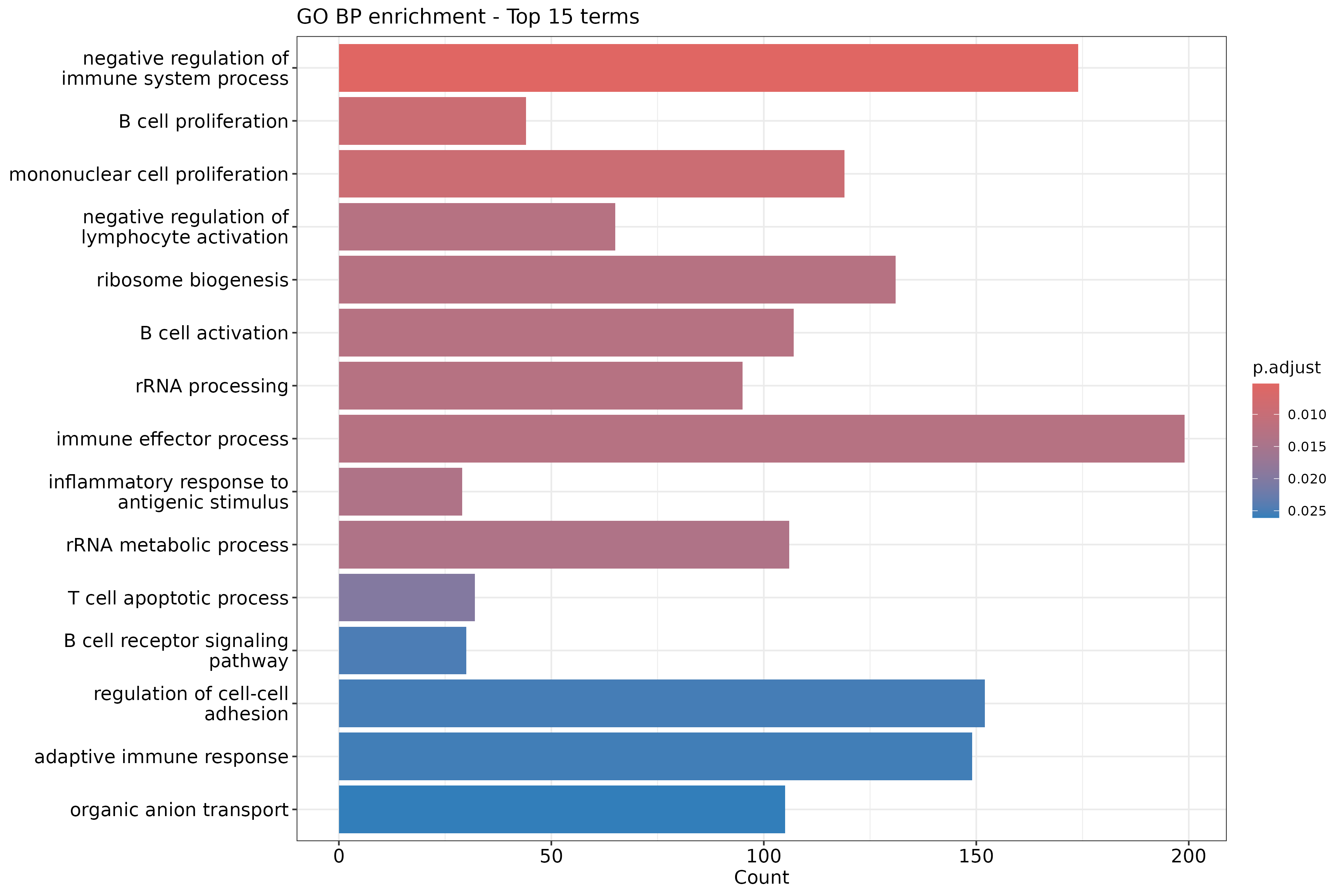
Image 1 of 1: ‘Simplified GO Biological Process enrichment barplot’
Simplified GO Biological Process enrichment barplot
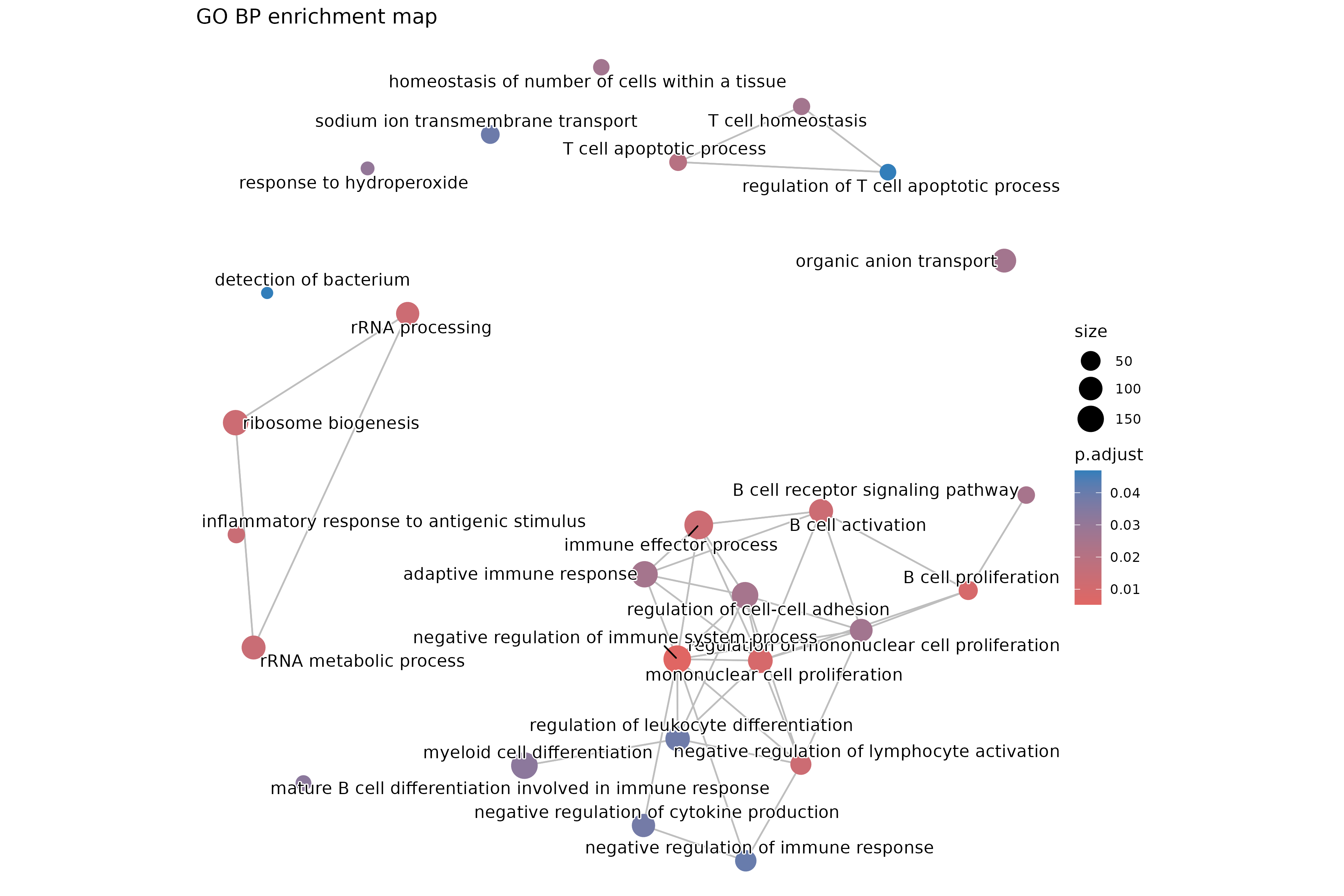
Image 1 of 1: ‘GO Biological Process enrichment map showing term relationships’
GO Biological Process enrichment map showing term relationships
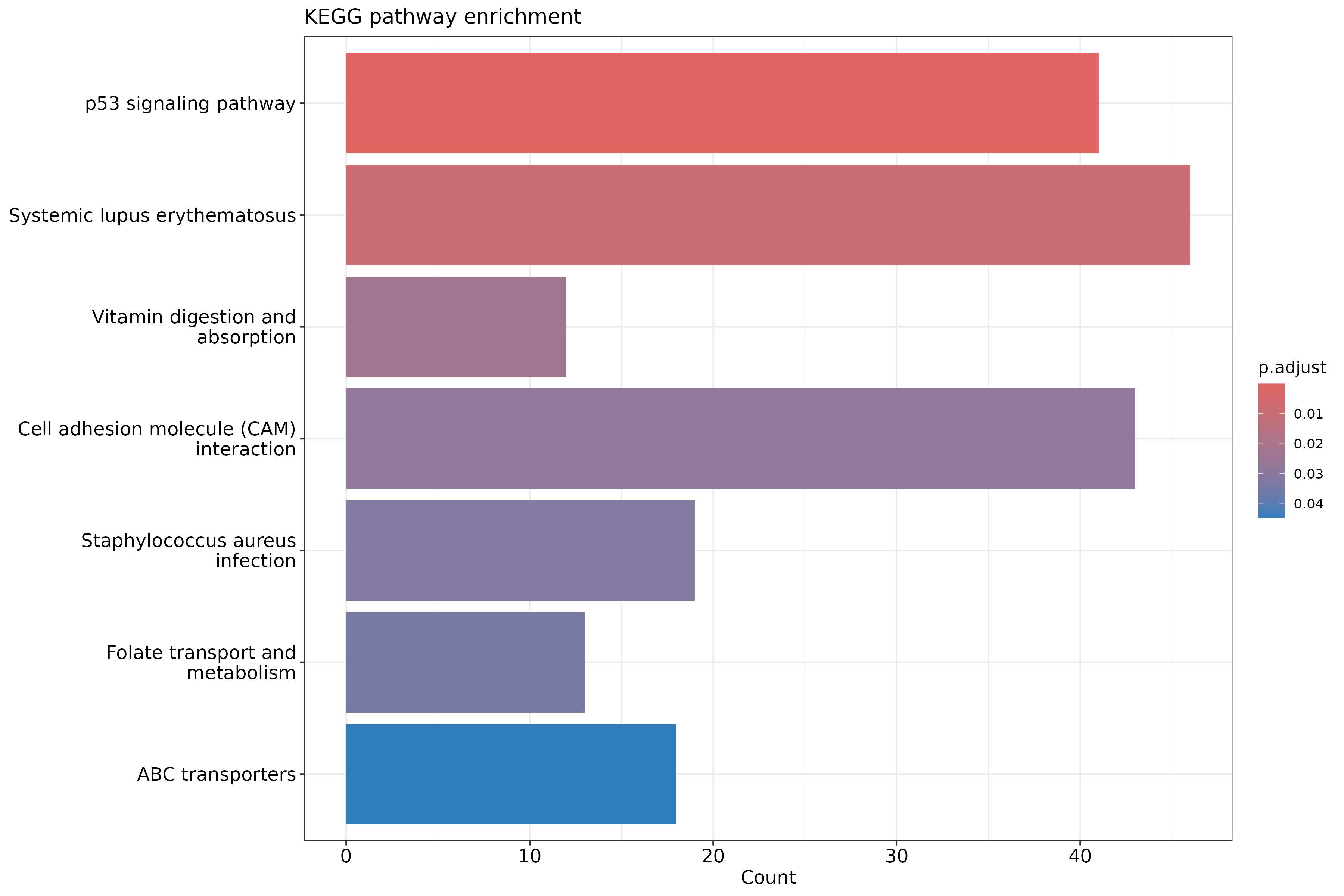
Image 1 of 1: ‘KEGG pathway enrichment barplot’
KEGG pathway enrichment barplot
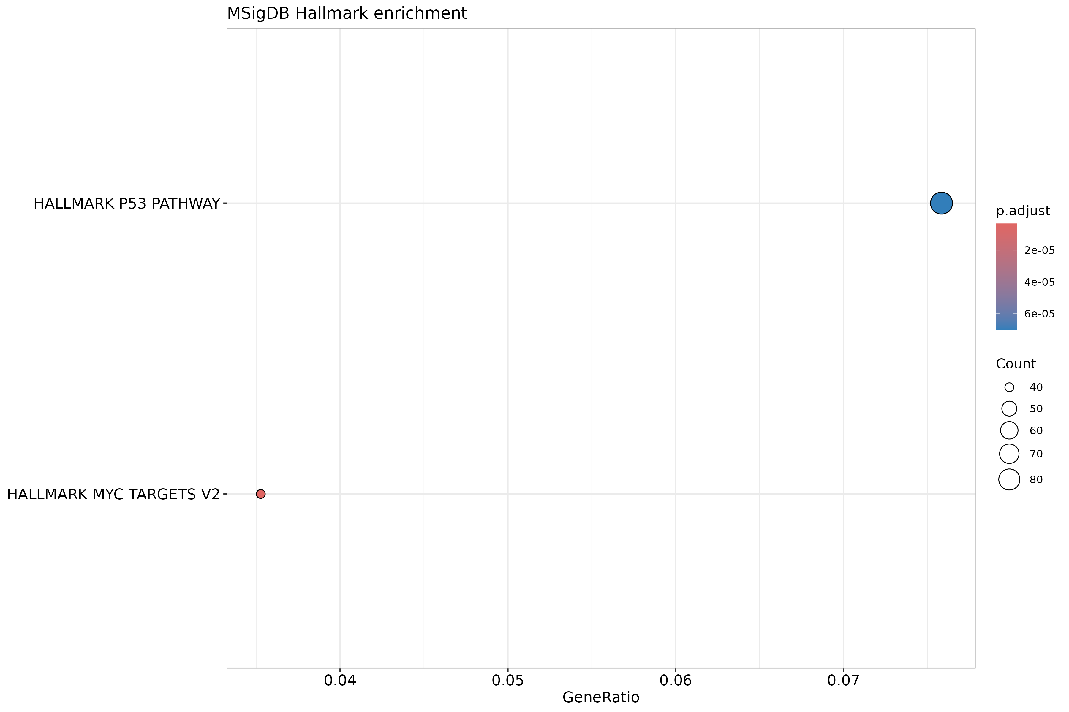
Image 1 of 1: ‘MSigDB Hallmark gene set enrichment dotplot’
MSigDB Hallmark gene set enrichment dotplot
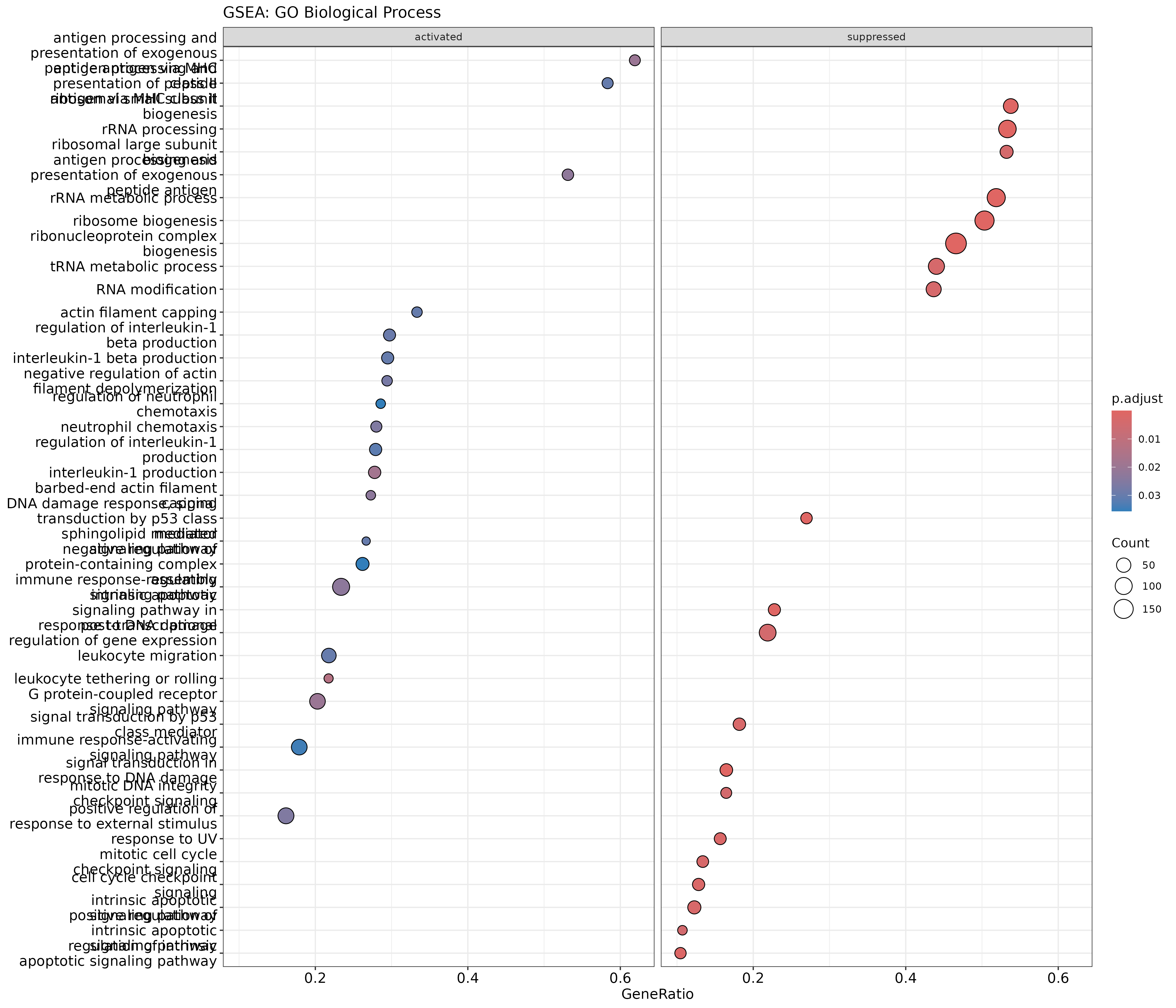
Image 1 of 1: ‘GSEA dotplot for GO Biological Process showing activated and suppressed gene sets’
GSEA dotplot for GO Biological Process showing activated and suppressed
gene sets
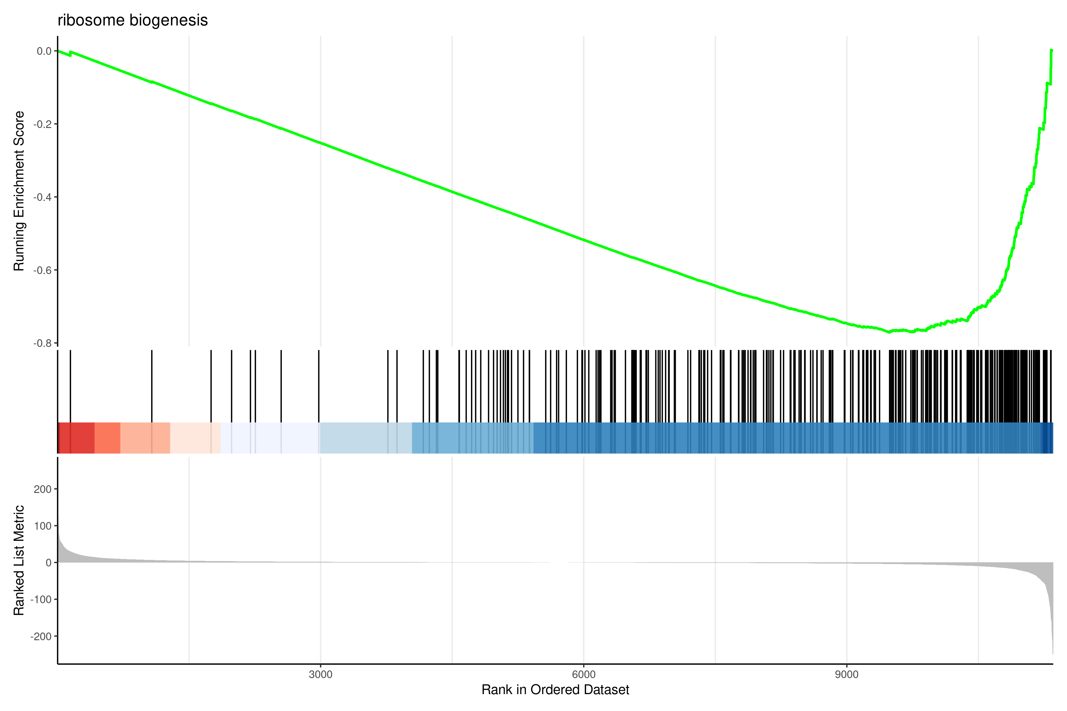
Image 1 of 1: ‘GSEA enrichment plot showing running enrichment score for top gene set’
GSEA enrichment plot showing running enrichment score for top gene set