Image 1 of 1: ‘Flowchart showing data quality control steps: NanoPlot assessment, Filtlong filtering, and post-filtering evaluation’
Overview of steps
Figure 2
Image 1 of 1: ‘Diagram showing PacBio circular consensus sequencing generating HiFi reads from multiple passes’
PacBio CCS overview
Figure 3
Image 1 of 1: ‘Diagram showing Oxford Nanopore read generation from signal detection through Dorado basecalling’
Overview of ONT read generation
Figure 4
Image 1 of 1: ‘KDE scatter plot of PacBio HiFi read length versus average read quality showing a tight cluster of reads between 15-30 kb with quality scores predominantly above Q20’
PacBio HiFi read length vs quality
Figure 5
Image 1 of 1: ‘KDE scatter plot of ONT read length versus average read quality showing a broad spread of reads from 1-200 kb with quality scores ranging from Q5 to Q20’
ONT read length vs quality
Figure 6
Image 1 of 1: ‘KDE scatter plot of ONT read length versus quality after Filtlong filtering showing reads concentrated between 20-80 kb with the shortest and lowest-quality reads removed’
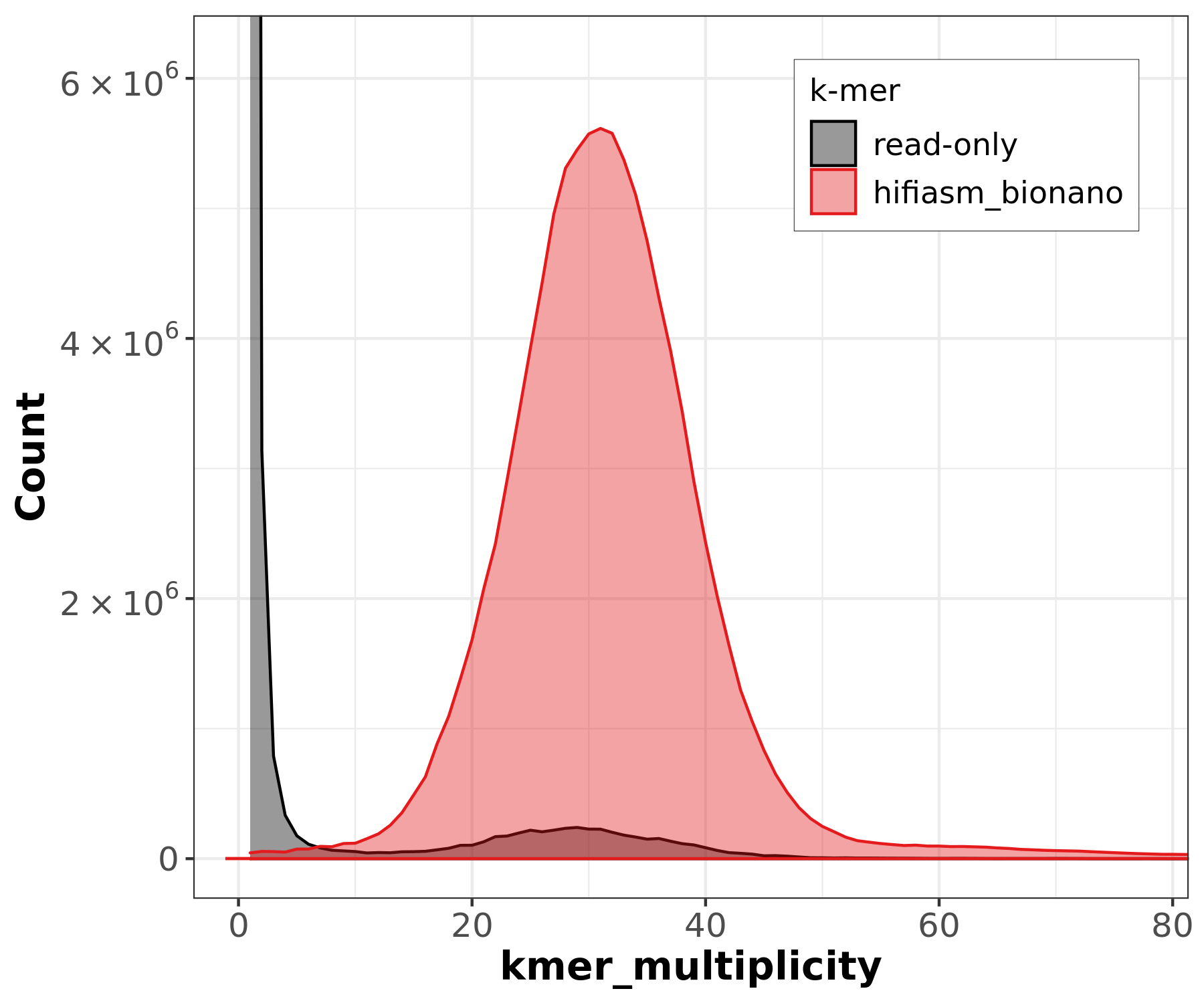
Image 1 of 1: ‘Merqury copy number spectrum plot for the hifiasm Bionano-scaffolded assembly showing a sharp unimodal peak at approximately 30x indicating a homozygous genome with high completeness’
Merqury copy number spectrum
Figure 2
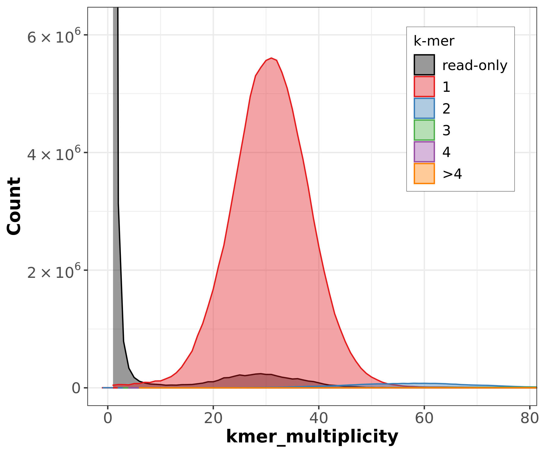
Image 1 of 1: ‘Merqury assembly spectrum plot comparing k-mers found in the assembly versus read-only k-mers showing most k-mers are shared between reads and assembly’
Merqury assembly spectrum
Figure 3
Image 1 of 1: ‘Screenshot of the Bandage application showing an assembly graph visualization with connected contigs’